The Foundations of a Successful Web Design Project
Whether you’re redesigning 800 pages or 8, every successful website redesign project begins with goal-oriented project planning. How well your site performs and whether it meets the needs of your customers and clients depend heavily on how we establish the goals of the project at the earliest stages. From a kickoff meeting to wireframes, these are the key elements of a successful web design project.

A strong kickoff meeting
We schedule a kickoff meeting to get everyone involved in the project around the same table.
Here’s an example of a generic kickoff agenda. Feel free to use and edit as you need. We modify this template every project, but it’s a great base.
This project kickoff meeting can take place in-person or via conference call, but we prefer to get everybody into one room, ideally for an entire day. We work through your long term goals, establish ad-hoc personas, decide on what information is most important to include in the information architecture, start teasing design aesthetic, and even dive into the technical nitty-gritty. We make sure we’ve got everything thoroughly accounted for before we start the planning and design process. Every kickoff meeting should establish clear, SMART goals for the website as well as a strong understanding of what the site’s users need to achieve.
Homepage information architecture
This phase varies from project to project, but I’ve recently adapted a simple approach that involved nothing more than a bulleted list of content we’ll be including on a wireframe. With the advent of responsive design, using a bulleted list for the information architecture saves us the headache of manipulating more content than we’re ready for, and gets everyone on the same page with the hierarchy of the layout.
For instance, a project we’re working on now includes these elements, and will be designed in an “infinite scroll” layout:
Branding statement
The primary emotionally communicative element of the design. It does not convey detailed information so much as give users an impression about what your company represents and help them identify with the organization. Vital to impart trust and reliability.
Variable featured content
Selected by site administrators, this area will include highlighted items from across the website such as events, images, etc.
Site navigation
This allows users to find the content they’re looking for; this will follow an anchor-text format for the infinite scroll type of layout.
Services/Value Propositions
Three separate sections (each with a photo gallery) that convey the breadth/depth of service capabilities in an engaging, informative way. Need to be able to add more service areas so will need this to be flexible in layout/style.
About Us
Team and corporate information, written to highlight the strengths of each and establish the importance of relationships and trust.
Communications
Feeds of recent items from sources such as the blog, Twitter, or newsletters, with links to the source articles where applicable.
Lead Generation
Basic inquiry form with contact information.
Footer content
Includes links for some site navigation, legal pages, and social networking pages, as well as location and copyright information.
All this in a simple Google document, shared with the client. They make comments, ask questions, and very quickly we’ve all got a solid understanding of what the order of information will be on the website.
The sitemap
Whether we’re launching with an MVP or a full site, we develop a sitemap that accounts for every single page on the site. Even for a redesign project, we take a close look at the sitemap and adjust as needed to create a more cohesive, streamlined user experience.
Depending on the number of pages on a website, we may use a simple Google Drive spreadsheet or a program like Slickplan to give our client a simple visualization of the pages on the site and how they’re structured within the navigation. A sitemap document helps inform the steps needed to complete content or content revisions for a web design project.
Wireframes
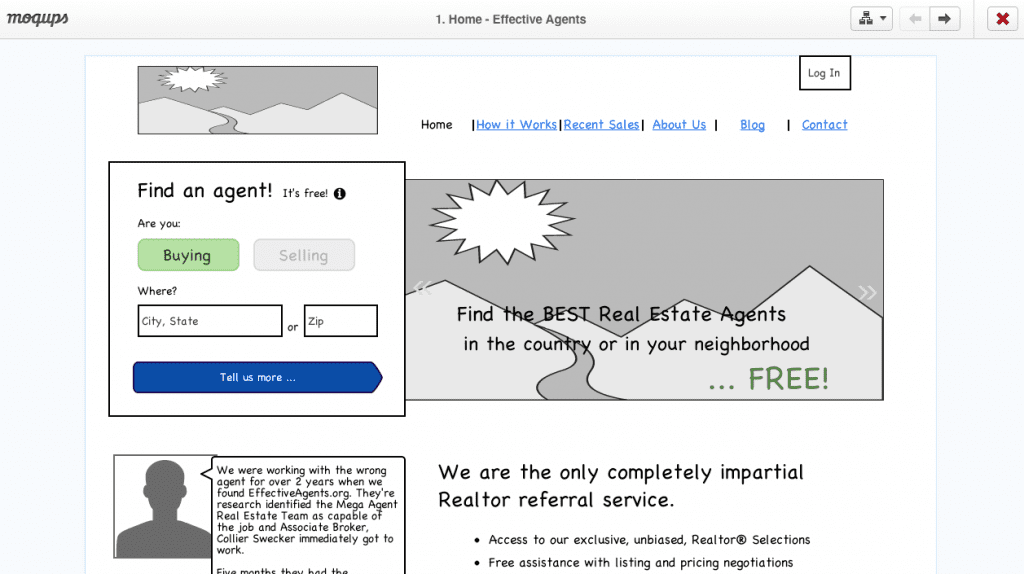
Depending on the complexity of a project, we move on to wireframes, which involve a black-and-white content-free simulation of the website layout.

We generally build lo-fi wireframes – meaning they’re very basic. We don’t really account for true scale or hierarchy, instead referencing the elements of the IA outline in a very simple fashion. We design mobile-first, wireframing the mobile version of the site.
We explore analytics and established goals, and organize content accordingly.
This type of framing allows us to negotiate the content strategy to determine if the layout will work for the client’s capabilities and meet their needs. We explore analytics and established goals, and organize content accordingly.
We usually wireframe the homepage and a number of key interior pages that will require individual design and styling so that we’re all on the same page before we start designing and developing. This also helps us to refine the development strategy, research plugins that we might need to employ or decide on what platform best suits the project (i.e. custom development, WordPress, etc.).
This process can be augmented with a number of additional steps depending on the scope of the project — steps like stakeholder interviews, SEO analysis, content strategy and user experience research— but this is the basic process we use to start any project, big or small.


