8 Nonprofit Websites to Look to for Design Inspiration
A well-crafted website is more than just a virtual brochure for nonprofit organizations; it’s a powerful tool for storytelling, connection, and impact. Through creative, thoughtful design, your site can communicate your nonprofit’s mission, attract potential donors, and significantly enhance your fundraising efforts. It can be a bridge between you and your donors and volunteers, fostering emotional connection and lasting engagement.
In this blog, we’ll explore 8 nonprofit websites that exemplify exceptional web development and design. From innovative layouts to impactful imagery, each website offers unique elements that capture attention and inspire action.
What Is SEO-Friendly Web Design?
SEO-friendly web design is a powerful strategy that enhances your website’s aesthetics and optimizes it for search engines. Integrating SEO best practices into your website’s design makes it easier for potential supporters and visitors to discover your mission and engage with your cause. Optimized web pages improve your rankings on search engine results pages (SERPs), driving more traffic to your nonprofit site and increasing visibility.
Big Sea specializes in SEO-friendly web design and high-quality content development, helping nonprofits transform their outreach efforts.

8 Great Nonprofit Website Design Examples
Our Favorite Large-Scale Aquatic Website: Mote Marine Laboratory and Aquarium
Mote Marine Laboratory and Aquarium is an innovative nonprofit science center and research institute dedicated to making science and technology accessible to everyone. Big Sea redesigned Mote’s website to feature dynamic design and compelling visuals that make the site a fun place for students and enthusiasts, all while maintaining sophisticated content governance structures on the back-end that make the page an evolving resource of scholars. It’s a tricky balancing act that required careful attention to website UX and an examination of the site’s various users and use cases.
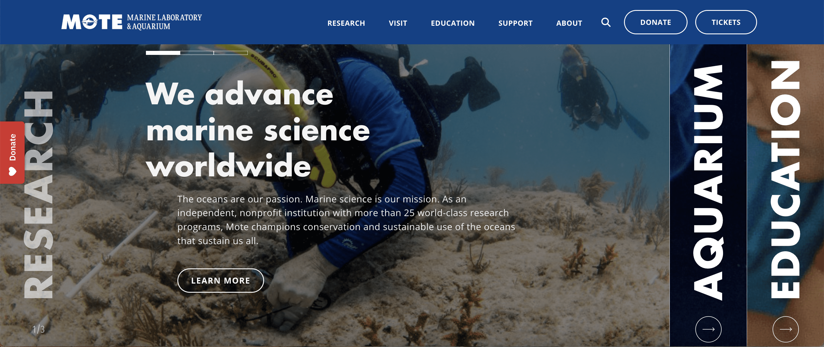
Stand-Out Design Features: Mote’s website features a vibrant, bright color palette that reflects the excitement of discovery. The straightforward, intuitive navigation lists categories for exhibits, education, research, and events—their most important pages. The prominent “Donate” button is also strategically placed in the main navigation bar to encourage engagement.
How This Enhances the User Experience: The engaging visuals and straightforward navigation create an emotional connection with site visitors, making it easy to explore their mission and get donation conversions. Users can quickly find information about upcoming events, which promotes a sense of expectation and community involvement.
Fundraising and Advocacy Tactics: Mote effectively highlights success stories and testimonials, motivating visitors to donate or participate in events. Their design elements encourage users to envision their contributions making a tangible impact.
Key Takeaways: Vibrant visuals combined with clear calls-to-action enhance user engagement and drive donations.
Our Favorite Website for Local Environmental Volunteering: Asheville GreenWorks
>> Visit the Asheville GreenWorks website.
Asheville GreenWorks promotes environmental sustainability in the Asheville community. Their mission focuses on ecological stewardship through community engagement.
Stand-Out Design Features: The banner image shows everyday people working on local projects and issues, while the headline emphasizes the impact volunteering has on you, the visitor, and your immediate family and community. This helps connect what can be a very abstract issue (climate change) directly to the user. A little further down a “by the numbers” graphic on the homepage highlights actual statistics about the scope and scale of their work.
How This Enhances the User Experience: Visitors can easily participate in the nonprofit’s mission and learn more about key issues.
Fundraising and Advocacy Tactics: Asheville GreenWorks effectively highlights its impact through catchy headlines, dynamic photos, and compelling stories that motivate visitors to support its initiatives. It also features a donation form directly on its homepage, so users don’t have to click on a new web page to support their cause.
Key Takeaways: Strategic above-the-fold design and copy immediately engage visitors and command attention.
Our Favorite Animal Rights Nonprofit Website: The Asheville Humane Society
>> Visit the Asheville Humane Society website.
The Asheville Humane Society is committed to rescuing and rehoming animals in need while promoting responsible pet ownership.
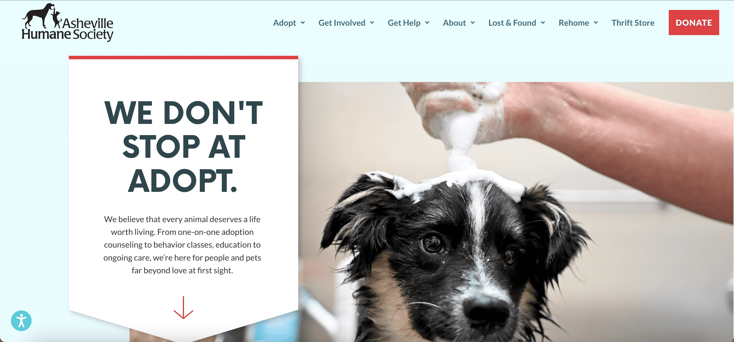
Stand-Out Design Features: You can’t go wrong featuring cute cats and dogs on the internet. The adorable animal photos are immediate attention-getters, and the arrow beneath the header directs users to start scrolling through interactive options that slide onto the page from either side as you descend. This design makes the site’s features and options too big to miss.
How This Enhances the User Experience: The heartwarming visuals create an emotional connection, while the straightforward adoption-related prompts and forms make the process easy for potential adopters.
Fundraising and Advocacy Tactics: The society effectively motivates visitors to donate or adopt by showcasing adoptable pets and success stories in a user-friendly manner.
Key Takeaways: Emotional imagery and user-friendly processes can significantly enhance engagement, advocacy, and fundraising efforts.
Our Favorite Mid-Sized Regional Museum Website: Tampa Bay History Center
>> Visit the Tampa Bay History Center website.
The Tampa Bay History Center is committed to preserving and sharing the rich history of the Tampa Bay area and educating the public about the region’s diverse cultural heritage.

Stand-Out Design Features: The website has a clean, modern design with a well-organized layout. Historical imagery creates an inviting atmosphere, with well-designed pages that showcase educational resources and events. The events section on the homepage has a unique scrolling functionality that showcases different events without the visitor having to click a button.
How This Enhances the User Experience: Visitors can easily find information about exhibits and educational programs, creating a user-friendly experience that encourages online learning and subsequently greater in-person attendance. The design fosters curiosity and encourages exploration of the region’s history.
Fundraising and Advocacy Tactics: As you scroll the homepage, a tab for purchasing tickets remains in place on the right side of the screen, making the option obvious but unobtrusive. The moving events listing, entitled “What’s happening at the museum right now,” creates a sense of urgency for visitors, encouraging them to act right away. Options to support the museum through membership or to simply sign up for their newsletter are prominently displayed on the top menu bar and at the bottom of the homepage, so that wherever you look you have options for greater engagement.
Key Takeaways: A well-structured website enhances user engagement and supports fundraising efforts.
Our Favorite Social Justice-Themed Nonprofit Website: Tracking (In)Justice
>> Visit the Tracking (In)Justice website.
The mission of Tracking (In)Justice is so closely aligned with the upfront function of its homepage that it feels at first almost like there’s no difference between the organization and its webpage:
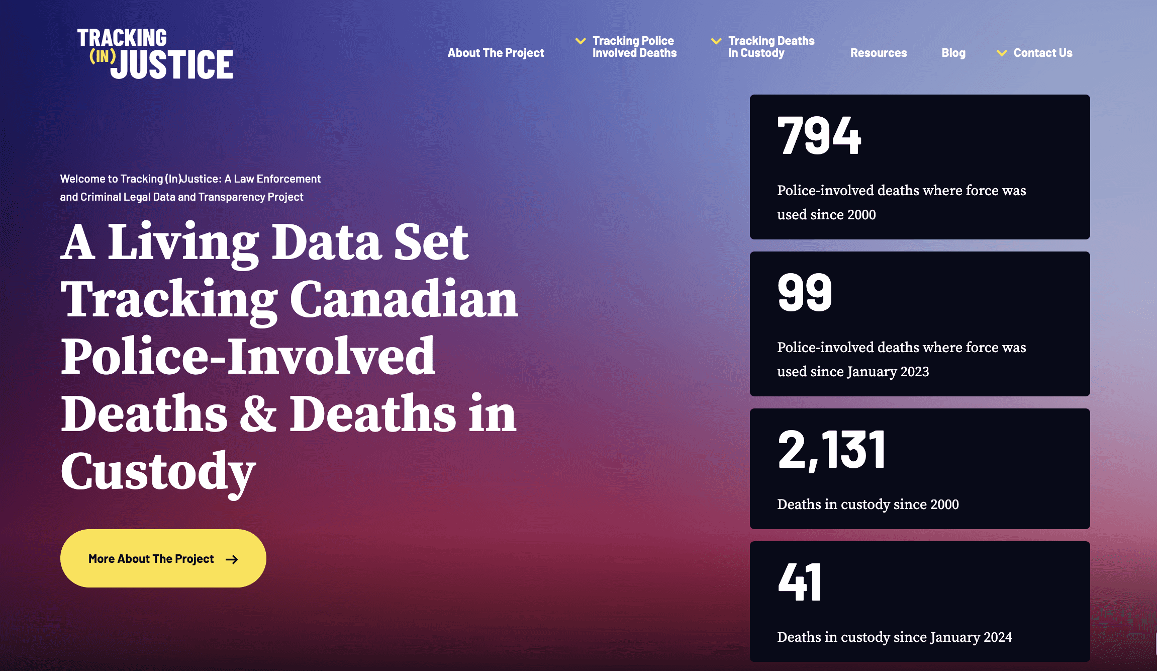
Stand-Out Design Features: The bold, clear, precisely-worded headline and the prominently featured statistics that appear right next to it make this nonprofit’s purpose instantly legible. Few sites manage to be as clear and compelling while being entirely text-based.
How This Enhances the User Experience: Since publicizing data is an essential part of the organization’s mission, the site feels almost like a dashboard. Once you’ve found the page, it’s the sort of place you’re likely to return to for updates and further information.
Fundraising and Advocacy Tactics: Clear calls to action at the bottom of the site show users how they can get involved, either by exploring the information on offer, improving the data set through tips, or citing it yourself in further reporting.
Key Takeaways: Video, photography, and interactive features are big attention-grabbers, but don’t underestimate the power of compelling text and crystal clear lay out.
Our Favorite Offbeat Museum Website: The Mütter Museum
>> Visit the Mütter Museum website.
Most of the time you want to know where you’re going. But sometimes it’s fun to get lost.
The website for Philadelphia’s Mütter Museum balances a clearly laid out homepage header with a peculiar patchwork of strange and unsettling content that perfectly fits the museum’s subject: medical history and human remains.
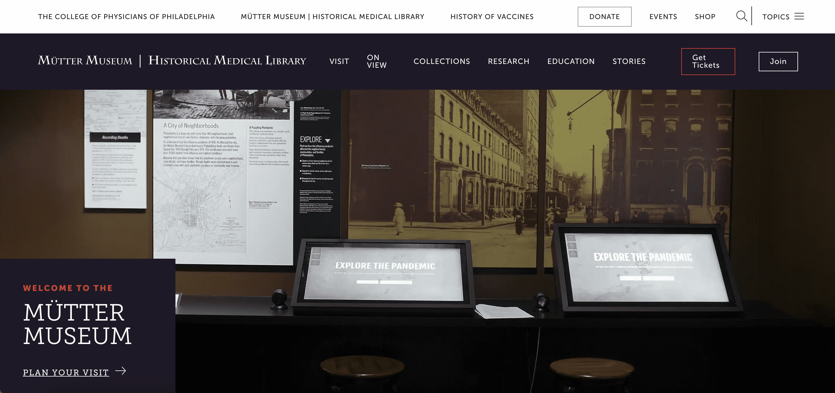
Stand-Out Design Features: A little more cluttered and open-ended than most of the sites we’ve shown so far, the Mütter Museum relies on the sheer weirdness of its content to do the selling. Skull collections, oversized papier-mâché eyeballs, articles on New England vampirism: it’s easy to get immersed by these odd offerings.
How This Enhances the User Experience: Wandering this little maze of online exhibits gives users a taste of what it will be like to actually wander the halls of the institution itself. There isn’t even a header at the top of the cite: just a call to action to “Plan Your Visit.”
Fundraising and Advocacy Tactics: Operated by the College of Physicians of Philadelphia, the museum has felt a special call since Covid to educate the public about the history of vaccines and pandemics. Prominent messaging on the homepage and on the donation page makes it clear that your support doesn’t just fund exhibits, it fuels education.
Key Takeaways: Go where your content guides you. Every organization is a little bit different, and the things that make your nonprofit unique should steer your design choices.
Our Favorite Regional Culture Nonprofit Website: Florida Humanities
>> Visit the Florida Humanities website.
Florida Humanities provides cultural access to all Floridians, wherever they’re located, by emphasizing partnership opportunities with nonprofit organizations to support communities with limited access to arts and humanities.
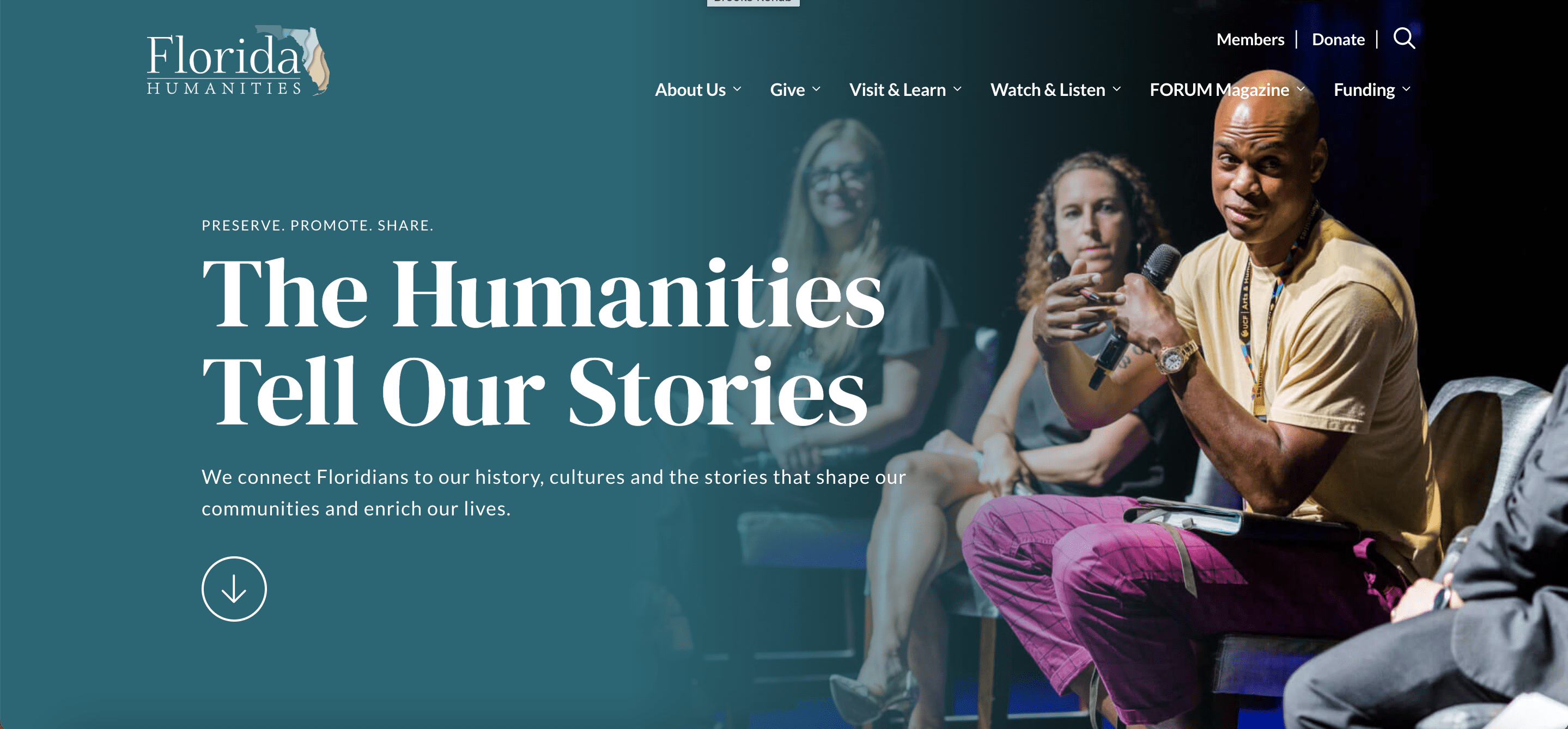
Stand-Out Design Features: The website employs a vibrant color scheme and engaging typography. Its layout is visually appealing and focuses on calls to action that promote upcoming events and initiatives. When users hover over many design elements, they move, highlight, or underline that section, adding emphasis and flow to the layout.
How This Enhances the User Experience: The use of white space allows for easy reading and navigation. Users can quickly find information about funding opportunities and events, enhancing their overall experience.
Fundraising and Advocacy Tactics: Florida Humanities encourages visitors to support their mission through donations and participation by showcasing impactful stories and projects.
Key Takeaways: Combining calls to action, effective typography, and compelling photography creates a welcoming atmosphere and directs visitors to take action.
Our Favorite National Environmental Nonprofit Website: The Natural Resources Defense Council
The NRDC is a prominent environmental nonprofit that protects the planet’s natural resources. Their mission is to advocate for policies that benefit the environment and public health.
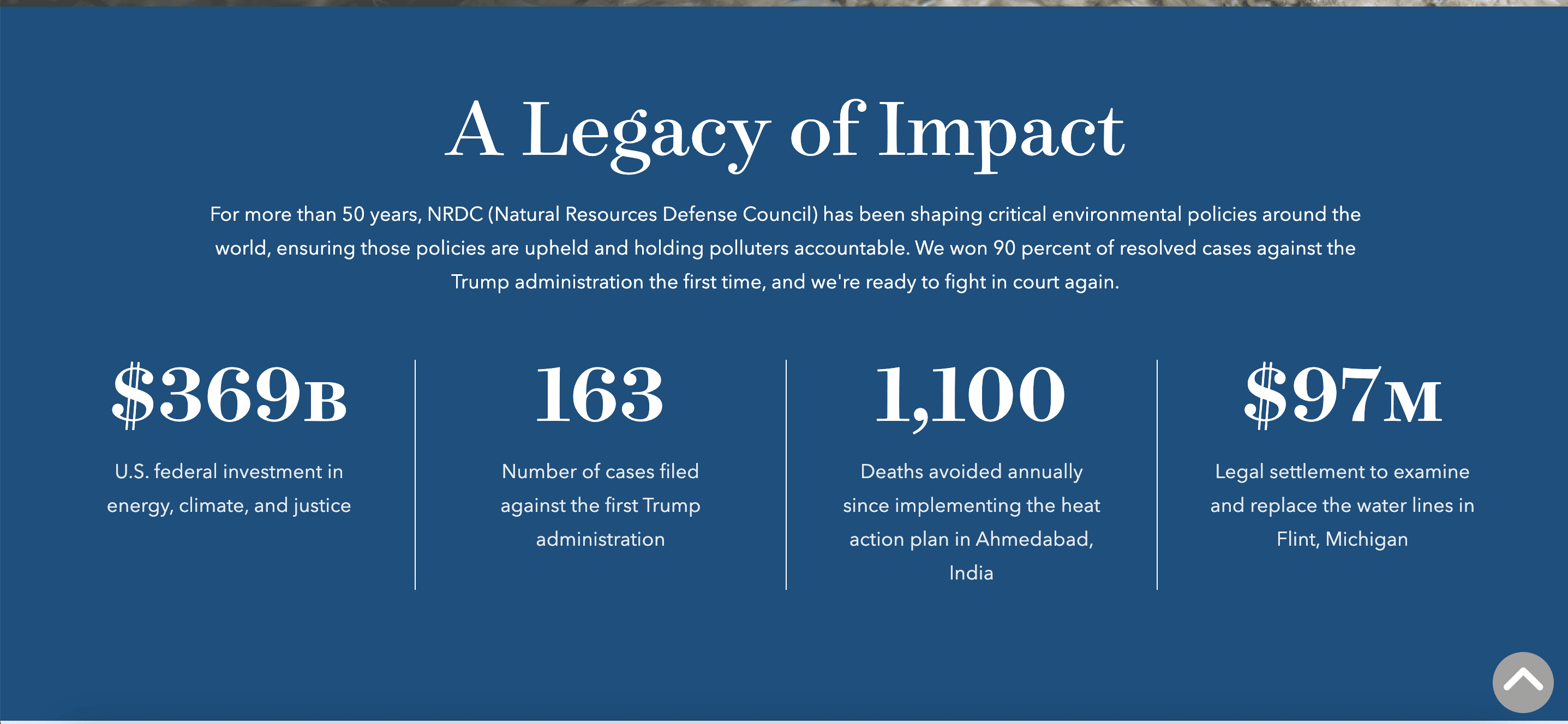
Stand-Out Design Features: The NRDC website features meaningful, detail-oriented content and a modern design. It emphasizes reports that quantify the impact of the organization’s initiatives and stunning imagery of its past work.
How This Enhances the User Experience: The easily digestible, well-designed reports help users understand the importance of the nonprofit’s work, generating trust and goodwill.
Fundraising and Advocacy Tactics: By showcasing reports and initiatives, the NRDC effectively demonstrates its impact and motivates visitors to support its mission through donations and advocacy. The Donate button in the main navigation menu also allows users to immediately select whether they want to make a one-time or monthly donation and the dollar amount before even pressing the button.
Key Takeaways: Visually engaging reports make information digestible and foster trust with potential donors and advocates.

Common Design Trends Among the Featured Nonprofits
Across these 8 nonprofit websites, several recurring strategies emerge, including:
- Intuitive navigation
- High-quality visuals
- Bold and visible calls to actions
- Strategic use of white space
- Visually striking color schemes
- Creative storytelling
- Easily accessible options for deeper engagement
- Clear and compelling mission statements
These elements create an engaging user experience that encourages visitors to support the organization’s mission.
Top Design Trends for Nonprofit Websites in 2025
Looking ahead, we expect to see trends such as immersive storytelling, personalization through AI integration, and cohesive, mobile-first design principles. Nonprofits can adopt these trends using user-friendly tools like WordPress or specialized nonprofit website templates.
If you’re looking for more information about some of these trends, take a look back at our 2024 Nonprofit Web Design Guide! These ideas will remain winning strategies in the next 12 months.
Tips for Improving Nonprofit Website Design
- Streamline Navigation: Simplify your top menu down to 5 – 7 items maximum. Use clear labels like “About,” “Programs,” “Donate,” “Get Involved,” and “Contact,” and add a sticky header so the navigation bar stays visible as users scroll down. You can also use website builders like WordPress or Wix with drag-and-drop navigation menus to easily reorganize pages.
- Nail Down Your Mission Statement: Use clear, bold typography and concise language. Pair this with an impactful hero image or video at the top of the homepage.
- Let Pictures Do the Talking: Invest in professional photography or create your own visuals using a high-quality camera or smartphone. Showcase real moments like events, beneficiaries, or volunteers in action. Choose images that are easy to understand, focusing on close-up shots of people’s faces to promote greater social connection.
- Create Clear Calls to Action: Use vibrant, clearly contrasted buttons with action-oriented text like “Make a Difference” or “Help Now.” Place CTAs at the end of sections and on every key page.
- Prioritize Mobile Responsiveness: Test your site on multiple devices to ensure responsive design. You can use Google’s Mobile-Friendly Test to identify and fix issues, and plugins like WP Touch Pro for WordPress automatically create mobile versions of your site so you can track the process through development.
- Leverage Social Media Integration: Link to platforms like Facebook to expand your reach. Use tools like Juicer or SnapWidget to display live feeds or hashtags from your social media accounts. For instance, add a “#YourNonprofitImpact” section showcasing user-generated content from Instagram.
Update Your Nonprofit’s Website Design with Big Sea
Effective nonprofit web design can transform your organization’s fundraising efforts and outreach initiatives. By taking inspiration from the featured examples, nonprofits can optimize their websites to better connect with supporters.
Ready to elevate your nonprofit’s online presence? Contact Big Sea for customized marketing solutions to help you achieve your goals!
FAQs about Nonprofit Web Design
How much does it cost to design a nonprofit website?
Costs can vary greatly based on features, providers, and customization needs. Your account manager will work with you to outline a budget, considering factors like site complexity and unique features. Many variables affect the cost of web design and development, such as website architecture, platform, number of unique pages, and custom-made features.
Which website builder is best for nonprofits?
Popular options include WordPress, Squarespace, and Wix, each offering unique features suited for nonprofits. Personally, we like WordPress.
Where can I find inspiration for designing a nonprofit organization’s website?
Refer to the examples in this blog to gain valuable insights into effective design strategies that enhance user experience and drive engagement. Contact Big Sea to make your nonprofit’s website a beacon of inspiration, inviting visitors to join your mission and make a difference.