Website Navigation Best Practices
Clear and intuitive website navigation is the backbone of any successful site. Whether building an e-commerce platform or a website for a major nonprofit, user-friendly navigation improves the overall user experience (UX), boosts search engine rankings, and keeps visitors engaged. But what really makes good website navigation?
This guide is packed with best practices, actionable tips, and expert advice on website navigation to help you create intuitive and effective main menus that drive results.

What Is a Website Navigation Menu?
A website navigation menu is a roadmap for visitors to explore your website. Typically, it’s a set of links organized into menus or lists that guide users to specific pages, subpages, and your other most important pages, helping them quickly find the information they need.
Good navigation menus are essential for two reasons:
- User Experience (UX): A well-structured system ensures visitors can explore your website without frustration or confusion.
- SEO Rankings: Clear and logical navigation aids search engines in crawling your website, improving your ranking on search engine result pages (SERPs).
When executed correctly, your navigation menu doesn’t just guide—it converts.
Types & Formats of Navigation
Not all websites are the same, and neither are their main navigation needs. Here are four common website navigation types to consider when building a navigation structure.
Horizontal Navigation Bars
These are ideal for smaller websites, portfolio sites, small businesses, or landing pages. They have a straightforward structure, and horizontal bars display navigation links across the top of a webpage.

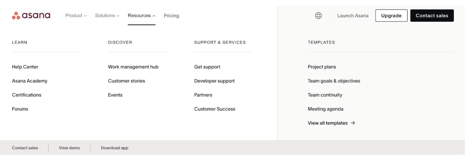
Mega Menus
Mega menus are great for content-heavy websites or online stores. They display multiple categories and subcategories in an expansive dropdown format.
Example: Asana’s mega menu enables users to browse an extensive range of products, solutions, and resources seamlessly.
Sidebar Navigation
Vertical sidebar menus are perfect for blogs or informational sites. They provide navigation items from the top to the bottom of the page, making it easier to display categories and subcategories.
Footer Navigation
This secondary menu is placed at the bottom of a page and typically features key links like “contact us,” “privacy policies,” or “social media links.” It serves as a safety net for users who scroll to the end of the page without finding what they need.
What Are the Four Rules for Designing Great Navigation?
Achieving excellent website navigation design is easier when you stick to these four golden rules:
1. Simplicity
Your navigation should be clean, clear, and easy to understand.
- Limit options to prevent overwhelming your users.
- Stick to short, descriptive labels like “About Us” or “Services.” Avoid jargon or overly creative terms that may confuse website visitors.
For example, Shopify’s clean menu items clearly outline the user’s options while keeping clutter minimal.

2. Functionality
Menus aren’t just visual elements—they must work flawlessly across all platforms.
- Test your navigation on different devices, screen sizes, and browsers.
- Ensure your dropdown or mega menus are intuitive, responsive, and free of bugs.
3. Accessibility
Your website navigation should be accessible to all users, including those relying on assistive technologies.
- Use clear headings, descriptive link text, and ARIA roles to accommodate screen readers.
- Ensure functionality without a mouse by making all navigation operable via keyboard.
Pro Tip: Hover menus can be problematic for touchscreen devices. Stick to clickable elements whenever possible.
4. Consistency
Uniformity across all pages ensures users always know where they are and how to move forward.
- Keep the navigation layout and style consistent throughout your website.
- For easier access, implement sticky navigation, a type of menu that stays visible even as users scroll down.
What Makes for a Great Navigation Menu?
A standout navigation menu goes beyond just following the basics. Take it a step further with these practices.
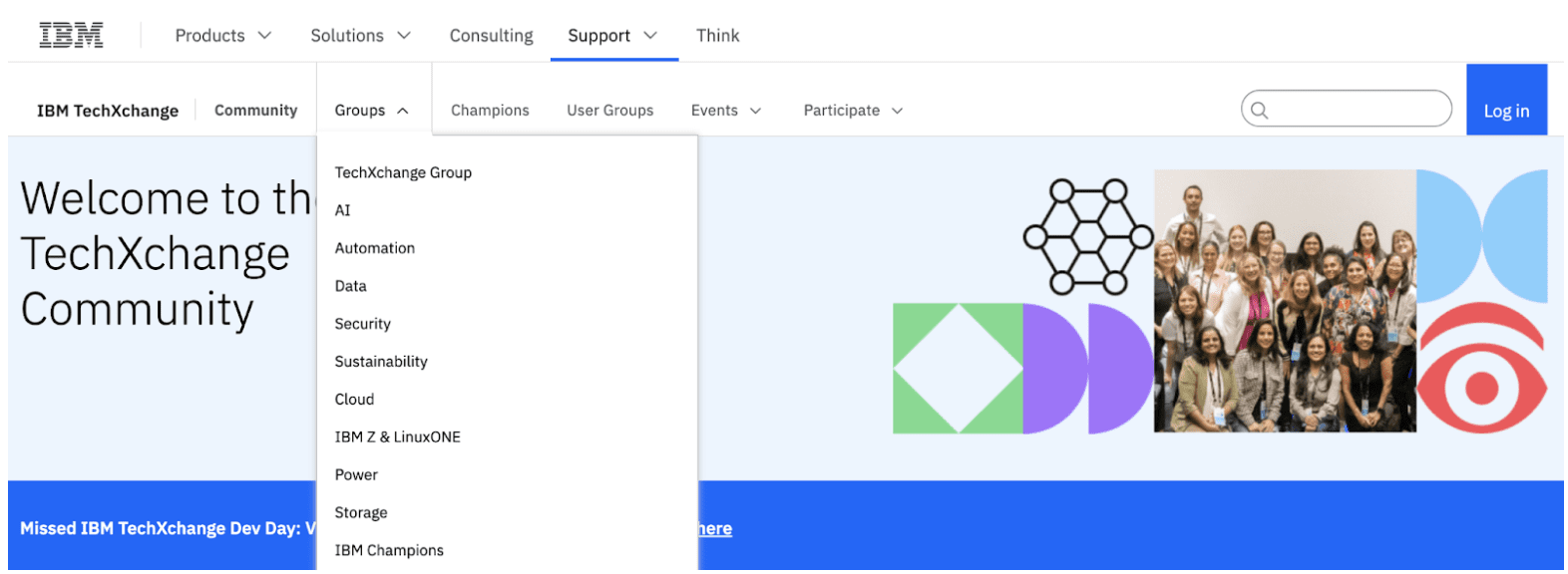
1. Consider Making Parent Pages Clickable
Ensuring that parent pages in your navigation are clickable helps to provide a seamless user experience. These pages should serve as both destinations and gateways. For instance, a “Products” page might offer an overview of all product categories and links to individual product pages. By making them clickable and actionable, users are not forced to rely solely on submenus, making it easier to access key content.
If you opt not to use clickable parent pages, indicate which are clickable and which aren’t, such as IBM’s example using carets (symbols) to expand the submenu when there is no parent page. In this case, any clickable parent page should not have a submenu associated with it.
2. Support Accessibility in Submenus
Accessibility should always be a priority, and submenus are no exception. Consider designing submenus to open with a click instead of hover, which ensures compatibility across various devices, including touch screens and assistive technologies like screen readers. A click-based system allows users more control and reduces frustration, especially when navigating with keyboards or devices without traditional pointers. Adding ARIA (Accessible Rich Internet Applications) attributes for proper announcements by screen readers further enhances inclusivity, making your website more user-friendly for everyone.
3. Always Consider Hover Functionality
While hover menus can add a sleek and dynamic touch, their usability comes with challenges. Without careful implementation, hover menus can lead to accidental clicks or premature activation, frustrating users. Including a slight delay—such as 200 to 300 milliseconds—before triggering the menu can mitigate these issues, ensuring that users have a moment to confirm their intent. Additionally, using large, well-spaced menu targets reduces the chances of misfires, while offering a manual close option ensures smoother navigation for users of all experience levels.
4. Use Breadcrumbs for Wayfinding
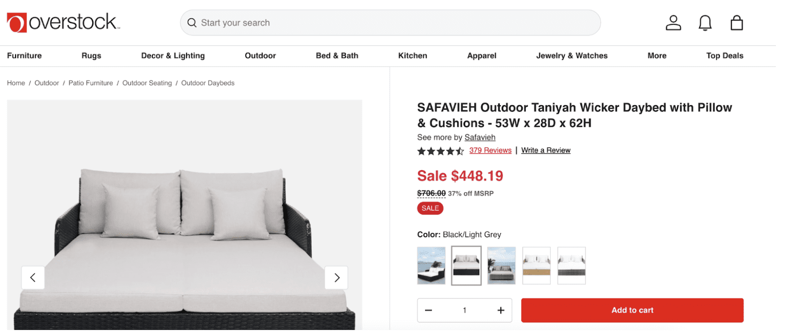
Breadcrumbs are a valuable navigation aid, allowing users to understand their location within the website’s hierarchy and retrace their steps intuitively. They are particularly useful for larger websites with deep folder structures, as they always provide a clear context for users. Not only do breadcrumbs improve user experience and accessibility, but they also benefit SEO by enhancing internal linking and reducing bounce rates through better navigation pathways.
Overstock.com offers an excellent implementation of breadcrumbs by displaying the entire path, from the home page to the current location.
5. Add a Utility Navigation
Utility menus serve as an additional layer of navigation, housing essential yet peripheral features like account login, language selection, chat support, a search bar, or contact forms. Placing these tools in a distinct utility area prevents the primary navigation from cluttering and ensures easy access to critical functions. For example, many e-commerce sites include a utility navigation bar in the header with quick links to shopping carts, order tracking, or help sections. This practice streamlines navigation and enhances efficiency, particularly for returning users familiar with the process.
6. Include Footer Navigation
The footer is an often-overlooked powerhouse of website navigation. Repeating key links and a call to action to significant website sections acts as a safety net for users who scroll to the bottom of a page but still need further assistance or direction. A well-designed footer often includes links to privacy policies, terms of service, contact information, social media channels, and even secondary navigation for additional resources. Footer menus are particularly useful on mobile devices, where users tend to scroll naturally. A robust footer boosts usability and contributes to a more professional and polished website design.
Other Best Practices for Effective Website Navigation
Sticky Navigation Bar
Sticky navigation bars are powerful tools for enhancing usability and user experience, especially on content-heavy websites. Keeping the navigation bar constantly visible as users scroll enables quick and easy access to key sections without requiring visitors to scroll back to the top of the page. This feature is particularly beneficial on mobile devices, where screen space is limited, and users often look for seamless interactions. When designing sticky navigation, ensure the bar is unobtrusive, avoids overshadowing website content, and remains functional across different screen sizes.
Use Hamburger Menus Strategically
While hamburger menus are a popular solution for compact navigation on mobile devices, their use on desktop interfaces should be carefully considered. On larger screens, hidden navigation can reduce visibility and make it harder for users to find essential links immediately. This design decision can frustrate users unfamiliar with the format, as they may not instinctively know to click the menu icon. When implementing hamburger menus, ensure their placement is intuitive, provide clear visual cues, and consider presenting important navigation options more prominently outside the menu.
Provide Local Menus
Local menus or sidebars can drastically streamline navigation on complex websites with multiple categories and subcategories. By offering contextual navigation tailored to specific sections, users can easily explore related content without repeatedly returning to top-level menus. For instance, e-commerce websites often provide local menus showing relevant product categories on individual product pages. Ensure these menus are logically structured, visually distinct, and easy to locate on the page. This will help users maintain their orientation and find what they need efficiently.
Limit the Length of Dropdown Menus
Dropdown menus are a convenient way to present additional navigation options, but they should be concise and carefully constructed to enhance usability. Overly long or cluttered dropdown navigation can overwhelm users, making it challenging to locate specific links. To ensure dropdown menus provide value without adding confusion, limit the number of options to 10 or fewer wherever possible. Consider grouping related items or using flyout menus for further categorization if necessary. Additionally, ensure the dropdown interaction is smooth and works seamlessly on desktop and mobile devices.
Keep Mobile Navigation Top of Mind
Mobile optimization plays a critical role in modern site design. Aim to deliver a seamless experience by addressing these essentials:
- Use larger touch targets for buttons and links.
- Avoid crowding the menu with too many items.
- Ensure all navigation elements are responsive to different screen sizes.
Create Impactful Website Menus
Effective navigation is a blend of art and science. The goal is to create an intuitive path for your users and help search engines understand your structure. By following these best practices, you can craft a site navigation experience that improves UX, boosts SEO, and keeps your audience engaged.
Need help perfecting your website navigation? The Big Sea team is here to guide you. Contact us today for expert advice to improve your site’s performance and user experience.