6 Signs Your Nonprofit Has Outgrown Its Website
Outgrowing a website is a sign of… well, growth! It’s like when a kid needs a new pair of shoes: it means you’re expanding and changing. The problem is that most nonprofits don’t notice they’ve outgrown their website until it’s a bit too late. Perhaps donors are starting to drop off, constituents are having trouble finding what they need, and your staff is losing time each week figuring out little workarounds. Good nonprofit website design should grow with you, but even the best website has a shelf life.
Below, we lay out six clear signs that your website needs some work, grounded in what we see with our nonprofit clients every day. If you recognize two or more of these, it’s probably time to talk about a website redesign. (And if you recognize all six, well, we should definitely talk.)

Sign 1: Your Donation Page Is Slowly Leaking Donors
The clearest sign a nonprofit has outgrown its website is a donation page that loses more people than it converts. If your donation form is long, clunky on mobile, or missing modern payment options, you’re losing donors you already worked hard to earn.
The data makes this concrete: the average nonprofit donation page converts at just 11% on desktop and 8% on mobile, according to the M+R Benchmarks 2026 report. That means roughly 9 out of 10 people who land on your donation page—people motivated enough to click “donate”—leave without giving.
Here’s what an outgrown donation form flow looks like in practice:
- Too many form fields
- No mobile optimization
- No digital wallet options like Apple Pay or Google Pay
- A jarring handoff to a third-party processor that drops your branding
- A layout that fights the donor instead of helping them
Donation buttons and calls to action that felt fine three years ago may be quietly costing you conversions now.
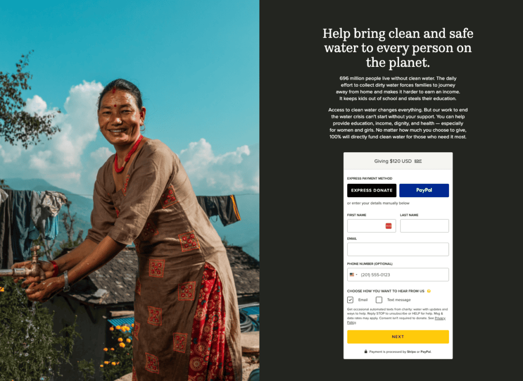
Then there’s the recurring giving problem, which is its own quiet revenue leak. If your website can’t accept monthly gifts, or if the recurring option is buried, hard to find, or awkward to set up, you’re leaving your most valuable donors on the table. Monthly donors give more over time and stick around longer; a site that can’t make recurring giving easy is a site actively working against your long-term fundraising. The same goes for any transaction obstacle: a donor who hits an error, a confusing step, or a dead end on your donation page is usually a donor you don’t get back. These small points of friction add up to real damage to your conversion rates.
With 52% of nonprofit website traffic coming from mobile, a donation form that’s merely “OK” on a phone is a form that’s failing most of your traffic.

Sign 2: Your Navigation Has Become a Digital Junk Drawer
If visitors can’t find what they need in a few clicks, your website’s information architecture has outgrown its original structure. This usually happens gradually as pages get added one at a time without an overarching plan until the navigation becomes a pile of links nobody can parse.
The “junk drawer” pattern is easy to spot once you know it. Every new program, campaign, and board request added a menu item, and now your navigation has 14 top-level options, three of which mean roughly the same thing. New content got wedged wherever there was room, not where it logically belongs, so it’s anyone’s guess where to look for it if you’re new to the site.
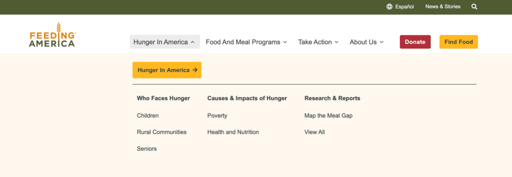
There’s also a dual-audience problem that’s unique to nonprofits. Your website has to serve donors, beneficiaries, volunteers, board members, and partners all at once. An outgrown website usually serves one group well and the rest poorly. A beneficiary looking for services shouldn’t have to wade through donor appeals to find help.
The fix is structural. Reorganize navigation around how your audiences move through the website, not around your internal organizational chart. This is core information architecture work. A strong sitemap with thoughtful user experience and UX/UI design are what separate a website people can use from one they leave in frustration.
Sign 3: Your Team Is Holding the Website Together With Duct Tape and Spreadsheets
When your staff spends more time working around your website than working in it, the website no longer suits your team. The telltale sign is a growing pile of manual workarounds: exporting data by hand, copying information between disconnected systems, or avoiding the CMS because it’s too fragile to touch.
Call it the “spreadsheet shuffle.” Your donor data lives in one system, your email tool in another, your event registrations in a third, and your website talks to none of them. Someone on staff has become the human integration layer, moving data by hand, and that someone probably has more urgent things to do.
If updating a single page requires emailing a developer, or if the content management system (CMS) is so clunky that no one wants to touch it, your website has become a thing your team has to deal with rather than a tool they use. A modern CMS like WordPress or Drupal should let a non-technical staff member update content without fear of breaking the website. If routine updates require custom web development every time, the platform itself has become the bottleneck.
Sign 4: Your Website Looks Like a Different Organization Than the One You’ve Become
If your brand or mission has evolved but your website hasn’t, visitors will encounter an outdated version of your organization. Stale visual design, inconsistent typography, old photography, messaging that no longer reflects how you talk about your work: these all signal a site that’s fallen behind the organization it represents. When your website’s graphic design no longer matches your current brand identity, the disconnect quietly erodes trust. Visitors notice, even if they can’t name what feels off.
Sometimes the gap is deeper than design. If your mission has shifted since you built the website, if you’ve added programs, changed who you serve, or sharpened what you stand for, a website stuck in the old framing actively misrepresents you. Your words and your work have moved on, but the website hasn’t caught up.
An outgrown website also tends to bury its best material, locking outcomes and impact in downloadable PDF annual reports instead of presenting them as living, visual, scannable content on the homepage or on service pages. The best nonprofit website examples turn impact into something people can explore through interactive maps, live metrics, and visual storytelling. Your impact is your strongest fundraising asset, and it shouldn’t require a download.
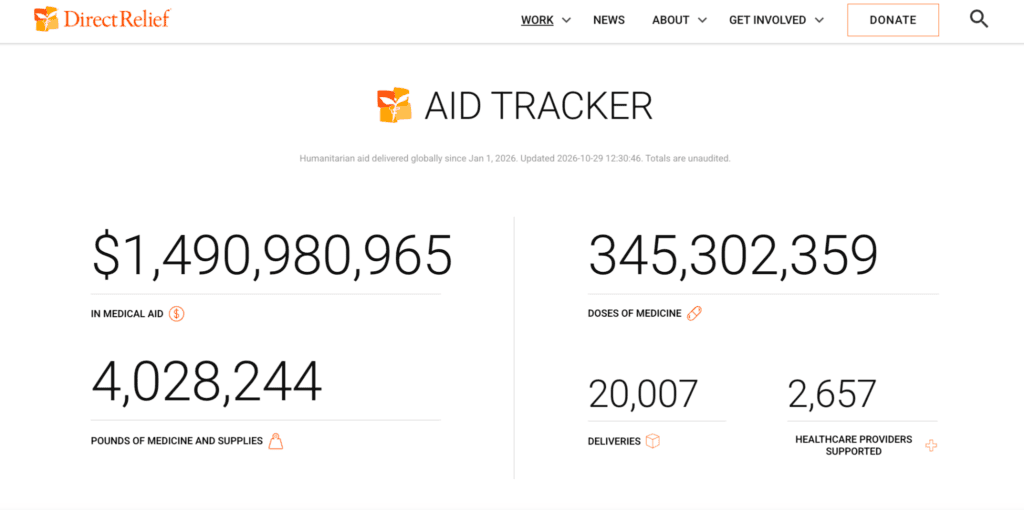
The sector has also moved away from savior-framing toward community-led, dignity-centered storytelling. If your website copy still centers the organization as the hero rather than the community it serves, the words have outgrown their moment.
Sign 5: You’re Running Events, But Your Website Can’t Keep Up
If your organization hosts events but your website doesn’t make it easy to share, promote, or let people register, your website has outgrown how you work. Events are one of the most common things a growing nonprofit adds, and one of the first places an aging website shows its limits.
The symptoms are familiar:
- No events calendar, so you post event details in a blog post or, worse, only on social media, where they vanish in a day.
- No registration or RSVP functionality, so you’re routing people to a third-party form that lives entirely outside your website.
- No easy way for staff to add or update an event without technical help, so the events page is perpetually out of date.
A website built for the nonprofit you used to be often assumed events were occasional. If they’ve become a core part of how you engage your community, raise money, or deliver programs, your site needs to treat them that way, with a real calendar, simple registration, and a publishing process your team can manage.
Sign 6: Your Website Is Falling Behind on Speed, Accessibility, and Security
A nonprofit website has outgrown its technical foundation when it loads slowly, fails accessibility standards, or runs on outdated, vulnerable software. These three issues are invisible until they cost you traffic, exclude users, or put donor trust at risk.
Speed
Google’s research shows that 53% of mobile visitors abandon a website that takes longer than three seconds to load, and bounce probability rises 32% as load time climbs from 1 to 3 seconds. Google’s Core Web Vitals make speed a direct ranking factor, so a slow website loses visitors and search visibility at the same time.
Accessibility
Meeting WCAG 2.2 web accessibility standards, the current benchmark, isn’t just an ethical obligation to the roughly 1 in 4 US adults living with a disability. It’s increasingly a legal exposure, as ADA-related accessibility claims continue to rise. An outgrown website often fails basic checks: poor color contrast, no keyboard navigation, missing alt text, unlabeled forms, and a layout that breaks on mobile without responsive design.
Security
A legacy CMS running outdated plugins poses an ongoing risk. For a nonprofit handling donor data and payment information, a breach can destroy donor trust. Ongoing maintenance, secure website hosting, and up-to-date software aren’t optional for most growing nonprofits today.
So You’ve Outgrown Your Website. Now What?
A website redesign starts with an honest audit of what you have, what’s worth keeping, what needs to go, and what’s quietly costing you money every month.
When it comes to getting buy-in, remember that leadership and boards respond to numbers, not aesthetics. Frame the redesign around the donors you’re losing to a clunky online donation page and the staff hours you’re burning on workarounds, not around how the website “looks dated.”
And build for the next decade, not the last one. The goal is a flexible, scalable website foundation that can grow with your organization instead of being outgrown again in three years. The best websites for nonprofits are built on current nonprofit web design best practices from the start, with search engine optimization (SEO), accessibility, and performance considered together rather than bolted on later.

FAQs
Common signs include a donation page that converts poorly, navigation that’s become hard to use, staff relying on manual workarounds because the website doesn’t integrate with your other tools, outdated design and messaging, no easy way to manage events, and lagging performance on speed, accessibility, or security. If two or more of these sound familiar, it’s worth evaluating a redesign.
The best donation platform is the one your team can afford and will use. Popular options include Fundraise Up, Givebutter, Donorbox, Classy (now GoFundMe Pro), and Bloomerang, and they all integrate with a website in some form. They differ in flexibility, cost structure, and the level of customization they allow. Givebutter is free to start and strong for smaller organizations; Fundraise Up and Classy offer more advanced optimization for larger fundraising operations; Donorbox sits comfortably in the middle. Rather than chasing the “best” platform in the abstract, pick the one that fits your budget, your team’s technical comfort, and the way your donors give. A platform your team uses well beats a more powerful one that sits half-configured.
Yes. Despite AI search and social platforms, your website remains the one digital space you fully own and control, and it’s still where the donation happens. Donation pages are still one of the highest-ROI investments a growing nonprofit can make.
A website builder with nonprofit website templates can be a reasonable starting point for a brand-new or very small organization on a tight budget. But growing nonprofits often outgrow builders because they limit customization, integrations, and the SEO control you need as your digital marketing matures. If your website is central to fundraising, programs, and outreach, a custom or semi-custom build on a flexible CMS usually serves you better over time.
Good website design removes friction between a motivated visitor and a completed gift: a short, mobile-friendly donation form, modern payment options including recurring giving, fast load times, clear calls to action, and impact storytelling that builds trust before the ask. Small design and usability improvements can drive meaningful revenue gains without increasing traffic.


