Healthcare Website Design: 10 Inspiring Examples (+ Tips)
Whether you’re looking for a deep dish delivery or a new doctor, what do we all do first these days? Whip out the smartphone.
According to a CDC report, almost 59% of US adults used the internet to look up health or medical information in the second half of 2022, and almost 42% used it to directly communicate with a doctor in the same time period.
In coming years, the number of patients turning to the internet for healthcare needs and online healthcare management will only continue to grow. Yet designing a beautiful, informative, user-friendly, SEO-driven, AI-friendly, and HIPPA-compliant website is no mean feat. It requires expert healthcare web design that balances aesthetics with functionality.
Let’s take a look at some of our favorite healthcare website designs and design examples to see what makes them stand out and provide some design inspiration.

10 Healthcare Website Designs We Love
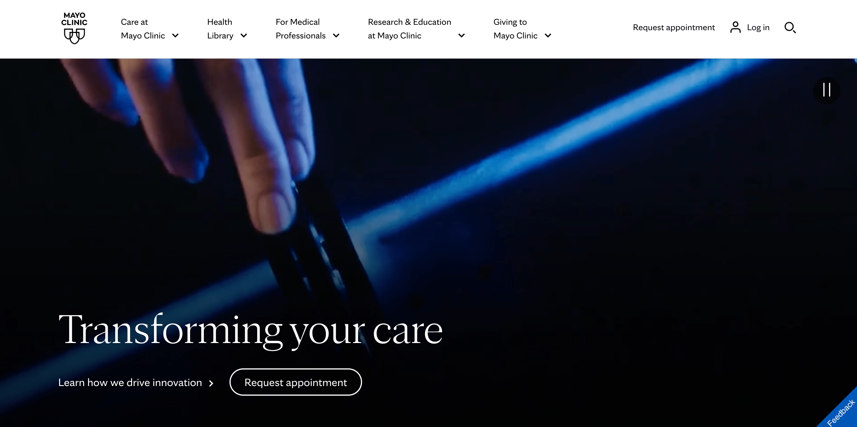
1. Mayo Clinic
We love Mayo Clinic’s clean, bold design and user-friendly navigation. Check out the fascinating, sometimes abstract videos playing behind a few simple pieces of text that lay out both the Mayo Clinic’s mission and a few key calls to action in the hero section.
As a well-known and respected research institution and world-class care center, the Mayo Clinic highlights both aspects of its work: “Learn how we drive innovation” directs users to a page highlighting research breakthroughs, while “Request Appointment” allows users seeking care to find the right page immediately.
Behind the scenes, Mayo’s outstanding search engine optimization (SEO) strategy captures traffic from internet searchers looking for trustworthy healthcare insights. The website’s use of structured data, together with its approach to information architecture, allows the website to serve Google an experience that is also great for searchers, so that no matter how you arrive at Mayo’s website, you find the information you need.
Overall, the Mayo Clinic site marries a clean, user-friendly design with a clear emphasis on its strengths as a highly trusted source of medical information, research, and care. It sets the bar for the best healthcare website architecture.
2. Cleveland Clinic
As an example of a patient-centered web design, the Cleveland Clinic does an excellent job of anticipating the most relevant information to present to current and potential patients, prioritizing the patient experience.
When you land on the site, just beneath an inviting, high-quality banner image, you see three graphic options that let users find a doctor, view directions & locations, or schedule an appointment. Again, much like Mayo Clinic, a user-centric navigation experience is also bolstered by a strong organic search strategy that brings users to many deeper pages that aren’t immediately visible in the menu.
Overall, the Cleveland Clinic website is effective because it is patient-centered, emphasizes staff expertise, and focuses on innovation and research.

3. Planned Parenthood
Unlike many healthcare sites, Planned Parenthood doesn’t overwhelm users with information at first glance. Instead, the site does an incredible job emphasizing its trustworthiness as a healthcare provider and a source of information on sexual and reproductive health with a few key call-outs. With that, we see a menu that puts educational information at the very front, with “Learn” as the first tab.
The bold background colors with white text draw users’ attention to important information about booking appointments, learning how to access safe legal family planning, and using a 24/7 chat for sexual health.
The website communicates to users that they can trust the organization—and healthcare organizations in general—to provide trustworthy information and in-person services and care.

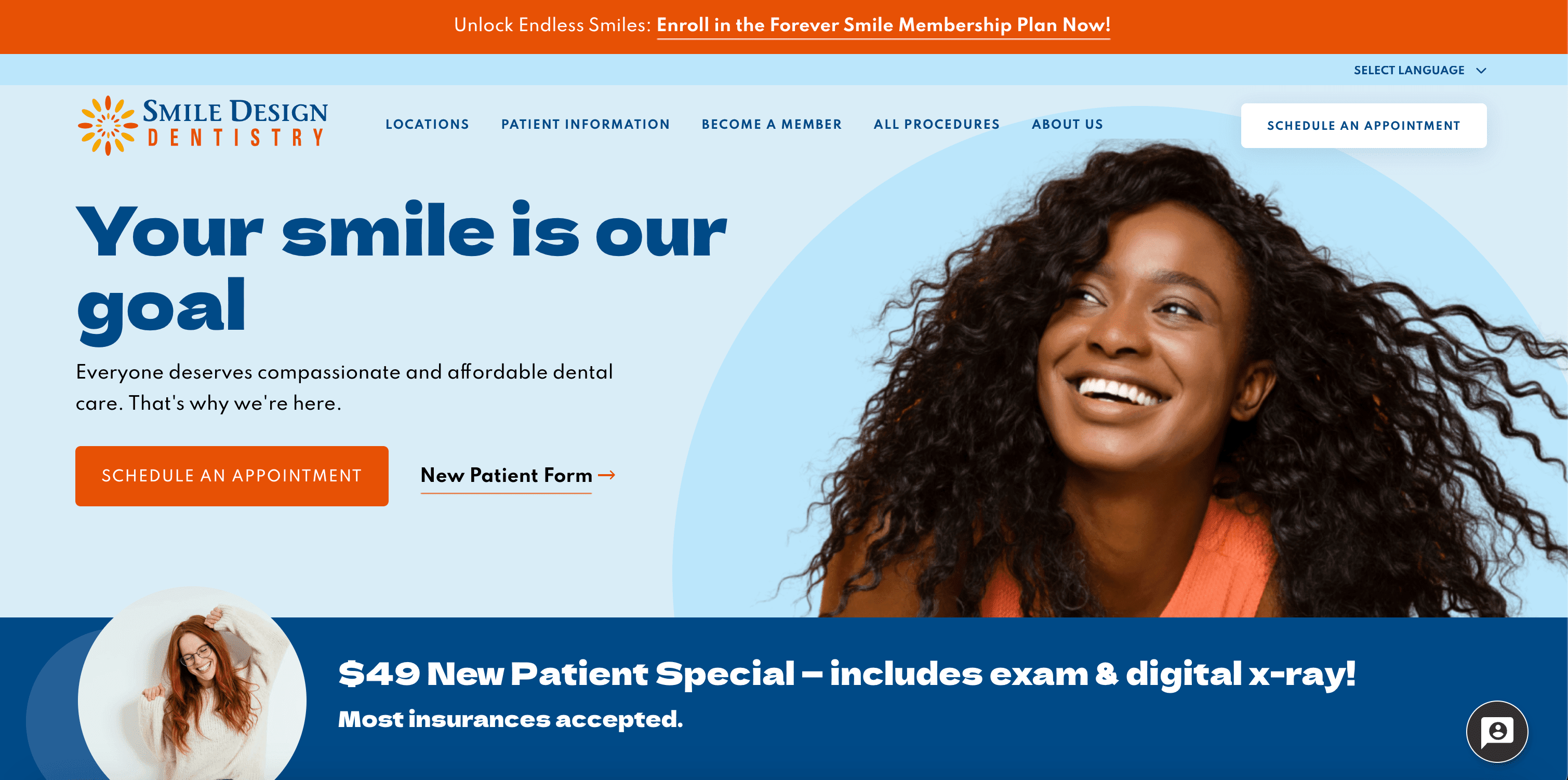
4. Smile Design
With clear, bold text and color choices, Smile Design Dentistry invites users to schedule an appointment, complete a new patient form, and learn about ongoing specials. This website achieves that patient focus we have seen on other sites in part through beautiful, high-quality images of big smiles to engage visitors and remind them of one of the reasons high-quality dental care matters.
Under the fold, the website highlights Smile Design’s multiple services and benefits through a mix of easy-to-read text and simple graphics. By prominently featuring a positive review, the site encourages new patients to learn more about Smile Design’s offerings. It’s a great example of medical practice marketing done right.
5. LED Technologies Inc.
LED Technologies Inc. demonstrates how a site can act as both an online storefront and an educational hub. Light therapy products and their uses are still unfamiliar to many, so LED Technologies foregrounds potential uses in skincare, pain relief, and in-home sanitation with beautiful images and simple, easy-to-read text in the hero section.
As users scroll through the website’s clean design, they will find more opportunities to learn about the science behind light therapy and LED Technologies’ products.
Products with highly visible star reviews appear at the bottom of the homepage. This allows website visitors time to learn about light therapy technologies before seeing the storefront. This is an example of an effective flow for educating website visitors about new healthcare products on an e-commerce platform.
6. Livongo
Livongo exists to help people effectively use their healthcare benefits to access smart devices and health coaching at no additional cost. Therefore, the Livongo website quickly communicates to visitors their role and the benefits users can gain from working with Livongo. Unlike some other sites on this list, Livongo’s user experience is structured around exploring its treatment options.
The website effectively uses a pop of green to draw attention to the fact that Livongo won’t cost users any money. In addition, the website uses bold text, simple icons, and ample whitespace to guide users in accessing Livongo benefits and to utilize smart website features.
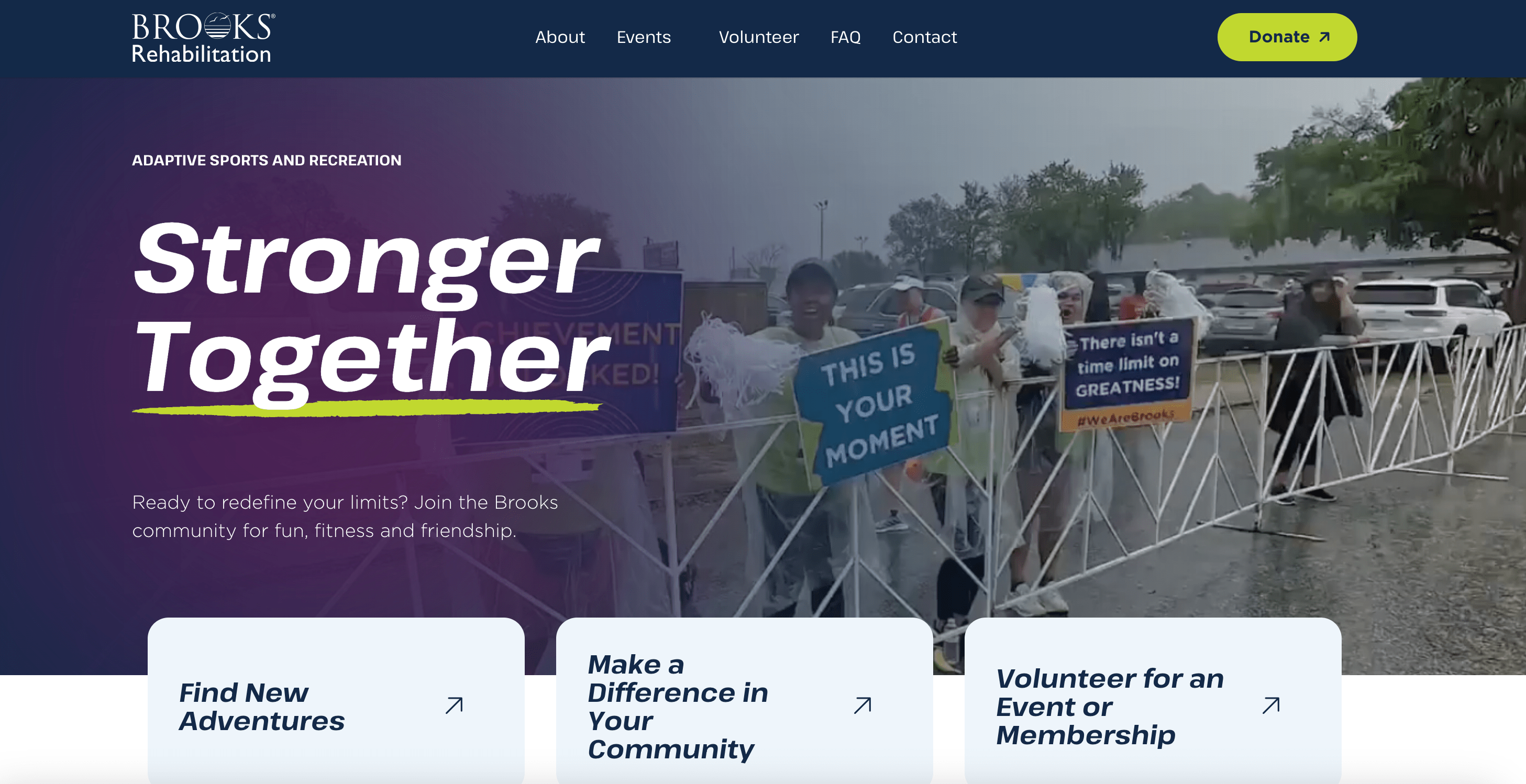
7. Brooks Adaptive Sports
Brooks Adaptive Sports immediately inspires website visitors with a celebratory, confetti-filled banner video of a race finish line. This page was designed not only to put patients and their caregivers at the center of the website’s story, but also to celebrate them, which is precisely the experience you have when you land on the homepage.
The three options for the hero section invite participation in the organization through events and volunteer opportunities. These design choices mean that inspired visitors can immediately find out how to deepen their interaction with the organization and increase user engagement. Right under the fold, a participant testimonial builds further confidence in the meaningful work Brooks Adaptive Sports does.
8. Michigan Avenue Primary Care
With its calming blue background and simple navigation, Michigan Avenue Primary Care is an effective service-centered medical website design. Whereas most of the examples in this list are patient-centered, this style allows users to navigate the site by choosing the kind of care they’re looking for, as well as other options such as paying a bill. That’s further evidenced by other choices, such as highlighting hours, booking appointments, and COVID vaccine information.
Under the fold, users can learn more about the practice. With ample white space and the continued use of a calming blue color scheme, patients are invited to learn more about specializations.
9. Skincare by Ava MD
With its teal accents, high-quality facility photos, and well-known endorsements featured in the hero section of the site, Ava MD immediately establishes itself as a premium destination for cosmetic dermatology.
Under the fold, bold color choices and images focusing on Ava MD services dominate. The easy-to-use website invites visitors to learn more about each service, acting as an effective landing page for potential clients.
10. Maven Clinic
The first thing you might notice about the Maven Clinic website is the hero image, featuring a baby in focus with other family members in the background, all set against a calming, soft green background.
Maven Clinic uses a limited set of search options to guide users’ understanding of its services through its “I’d like to find out about” search. This choice allows website visitors to immediately intuit the potential role of Maven Clinic in individual and group healthcare.
As users scroll, Maven Clinic emphasizes its specializations in fertility care and telehealth with clear text and images.
Tips For Designing a Great Healthcare Website
As we saw in these examples, there are really two main strategies for approaching a healthcare website: patient-centered and service-centered. In the former, the navigation emphasizes the patient’s experience and guides them through choices they might make. In the latter, the website is structured around choosing among the various services. Your choice in strategy should reflect who you are as an organization.
What Features Should Be Included in a Healthcare Website Design?
When it comes to web design for healthcare, ensuring your content is trustworthy and evidence-based is key to building trust with visitors. Your website users will trust that your site contains up-to-date and accurate health information, and meeting that need for high-quality information is one of the key ways your website can serve patients and potential patients.
In addition to high-quality content, effective healthcare websites have clean, simple, and intuitive designs that make it easy for users to navigate and find the information they need. Always ensure your website is mobile-friendly and ADA-compliant so all users can access it seamlessly. This means prioritizing responsiveness and website accessibility (following WCAG guidelines).
Use high-quality images of staff, facilities, and more to make the website visually appealing and easy to navigate. Pay attention to readable fonts and accessible colors. If you’re not sure how to begin making your healthcare website both aesthetically pleasing and highly functional, check out our guide on website redesign for some additional tips and ideas.
Finally, be sure to include features such as online appointment scheduling, useful search functionality, and, when appropriate, interactive or specialized content that showcases your strengths. This could consist of patient testimonials via text or video, case studies, explainer articles or vlogs by staff members, facility tours, informative blogs, and more.
What Features Should a Healthcare Website Include to Improve Patient Engagement?
Beyond the basics, think about the tech stack. Whether you use a customized template or a robust WordPress build, your website needs to be scalable to grow with your practice.
By following these tips, you can create a healthcare website that is informative, user-friendly, and builds trust with both current and potential patients.
Why Care About Your Medical Web Design?
With the rise of online healthcare research and communications, healthcare websites are now the initial touchpoint for patients seeking providers, services, and facilities. This makes healthcare marketing and website design crucial for fostering patient engagement, satisfaction, and potentially, even health outcomes. It matters to patients and to healthcare professionals.
Strategic website design also drives business, especially if you employ search engine optimization (SEO) expertise to help you make the most of your content.
Discover How Big Sea Can Improve Your Healthcare Website Design
At Big Sea, we thrive when we partner with organizations that make a difference in people’s lives, which is why we love helping health and wellness clients create incredible websites and effective marketing strategies. If you need a web design agency that understands your mission, contact us today to get started.

FAQs
What Do The Best Healthcare Websites Have In Common?
They all share a commitment to user engagement, speed, and accessibility. They prioritize the patient experience by making navigation intuitive and ensuring the website works perfectly on mobile devices (responsive design).
How Can I Be Best Prepared To Start A Medical Website Design With Big Sea?
To hit the ground running, have a clear understanding of your target audience (patients vs. professionals), your primary goals (booking appointments vs. education), and your brand guidelines (logos, colors, fonts). It’s also helpful to have examples of the best healthcare website designs you admire!
Do You Ensure My Website Is Mobile-Friendly?
Absolutely. We prioritize responsive design in every build. With so many patients accessing healthcare information via smartphones, a nonresponsive website is a nonstarter.