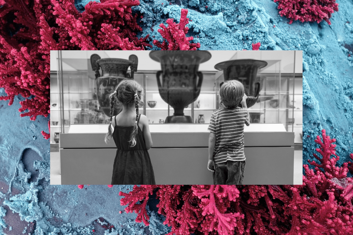
16 Best Museum Websites in 2024
For museums and educational institutions all over the world, Covid-19 was a crash course in the importance of using the internet. Nearly 77% of museum professionals report that the lockdown forced them to reconsider their digital strategy.
For some, this meant rethinking their approach to social media. For others, it meant investing in new ways to reach out to potential visitors through email marketing.
But the centerpiece of any organization’s online activities (and digital marketing strategy) is always first and foremost: its website. Your museum may close its doors each night, but your website is open 24/7, and it’s the first place people are likely to go when they hear about you.
That’s why we’ve put together a list of 16 of the best museum websites to give you some design inspiration and show you what’s possible.

What Makes a Good Museum Website?
A good museum website should show new visitors what it’s like to go to your institution for the first time. It should give them opportunities to explore, donate, and plan a visit. The homepage in particular should capture the feeling of your museum with eye-catching visuals of your exhibits and your interiors. There should be enough content that you can start to satisfy visitors’ curiosity while reminding them how much more there’ll be to see in person.
Our Top Museum Website
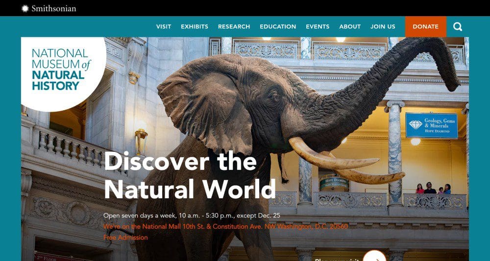
1. The National Museum of Natural History
What can we say? This one’s a stunner. The photo on the National Museum of Natural History’s homepage conveys a sense of scale and grandeur that instantly makes you want to see it for yourself. The human subjects in the background on the second-floor balcony are dwarfed by the 11-ton, 13-foot-tall elephant in the rotunda.
A good museum homepage should welcome you to the institution in digital form and beckon you to go exploring in any number of directions. This page does exactly that — just click on the “Exhibitions” tab in the top-of-the-page navigation bar to see how many paths there are to go down. A page called “Objects of Wonder” takes users behind the scenes to one of the museum’s support centers and features an interactive map darting back and forth across the globe as you view particular objects from the collection.
The web design is also kid-friendly without seeming too child-centric: photos foreground the way children can interact with the exhibits, and the simple white and teal color scheme and the large Helvetica fonts emphasize clarity and quick comprehensibility.
The Best Museum Websites for History Buffs
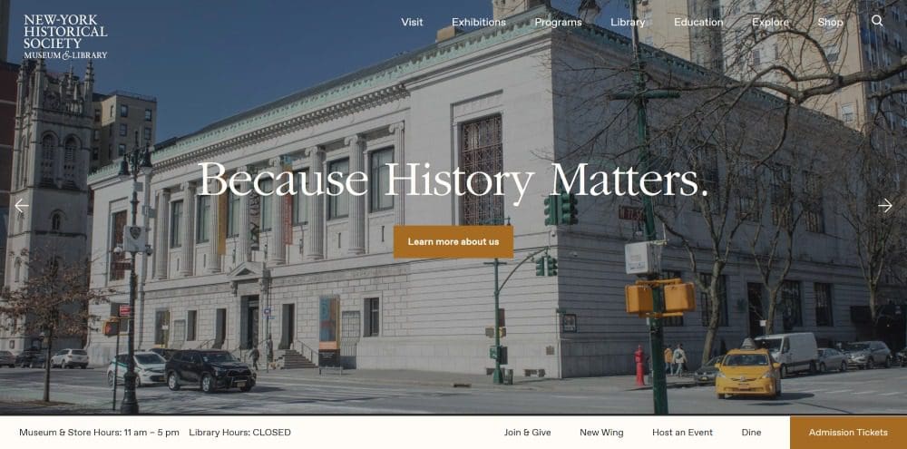
2. The New York Historical Society
Begun over 200 years ago by founders who had lived through the American Revolution and the British occupation of New York, the New York Historical Society Museum and Library preserves and displays over 400 years of the city’s history.
The rotating banner at the top of the page announces the organization’s mission “Because history matters,” and rotates every few seconds between clear, high-quality images of ongoing exhibitions ranging from a history of Jewish delis, contemporary art that recontextualizes 19th-century illustrations of the Civil War, and an online virtual tour of the museum’s exhibit about Black dolls. The site’s resources are rich and the homepage moves smoothly from featured exhibitions, to a calendar of events, to programs and events and opportunities to donate.
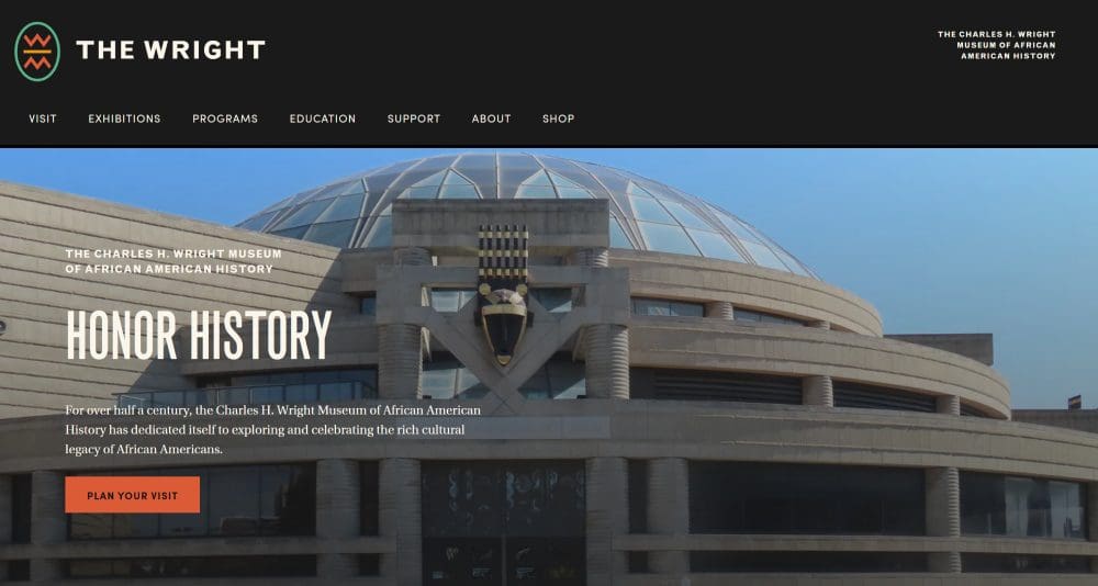
3. The Charles H. Wright Museum of African American History
At first glance, the website for Detroit’s Charles H. Wright Museum of African American History has a similar color scheme to the Funeral History Museum’s — the home page is mostly dark gray, and brownish beige fills most of the home screen. But bright pops of rust, teal, and parchment on the navigation bar’s drop-down menus suggest a muted version of the pan-African colors of red, green, and yellow.
Clearly laid out and easy to navigate, the page draws visitors to the site’s numerous online exhibits, including installations about the musical legacy of Detroit’s musicians, African American resilience from the Middle Passage through the Civil Rights movement, and the stained glass portraiture of Samuel A. Hodge.

4. The Tampa Bay History Center
The homepage for the Tampa Bay History Center leans into the exciting nautical history of the Florida coast, where pirates roamed the waters in the 17th and early 18th centuries. Their “Treasure Seekers” exhibit features a 60-foot 18th century pirate ship as its centerpiece surrounded by centuries old nautical artifacts as well as hands-on interactive exhibits that help immerse the visitor in the experience.
Browse the top of the page menu and you’ll find links to a range of online exhibits — often accompanied by short YouTube videos — introducing you to the center’s Touchton Map Library and its “Travails and Triumphs” exhibit highlighting the deep roots of Tampa Bay’s African American communities.
The Best Museum Websites for Strange or Quirky Subjects
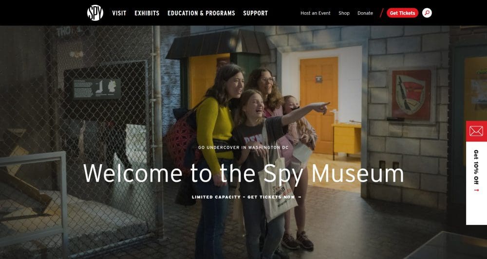
5. The International Spy Museum
The idea of a museum dedicated to teaching the public about secret, covert operations might seem like an oxymoron, but that’s exactly what you get at the International Spy Museum in Washington, DC. The website is replete with information about the museum’s eye-catching exhibitions and artifacts. Visitors can test their skills of observation and memory, learn about espionage during the Revolutionary War, and study the hazy boundaries around domestic surveillance.
The site also features individual pages dedicated to some of the museum’s most remarkable objects — everything from a 4.5mm single-shot lipstick pistol made by the KGB in the 1960s, to pigeon-mounted cameras to photograph battlefields in World War I, to rectal tool kits issued to CIA officers during the height of the Cold War — yes, you heard that right.
These individual pages not only give visitors a chance to learn and explore before they arrive at the museum — they also boost SEO by offering search engines multiple ways back to the museum’s domain.
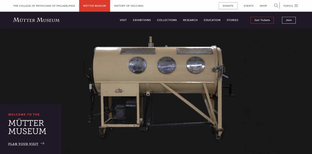
6. The Mütter Museum
One of our recurring themes is that good design will reflect what’s distinctive about your institution. Well, Philadelphia’s Mütter Museum is very distinctive — and its website makes no secret of that fact. Founded in 1859 when an American surgeon left the Philadelphia College of Physicians his private collection of rare and peculiar medical specimens, the museum houses a wide-ranging assortment of medical curiosities.
The homepage greets you with the blinking image of an antique, illustrated bloodshot eye. As soon as you start to scroll you’re immersed into the dark and unusual subjects on display: an exhibit about 19th-century funerary practices and beliefs about vampires, a giant paper-mâché eyeball from the 1800s used for instructing physicians in the days before refrigeration, a link to the museum’s podcast with an episode about clubs for people with no noses in 17th century London. It’s hard not to start exploring right away, and the site consistently offers engaging content that draws you in but leaves you wanting more.
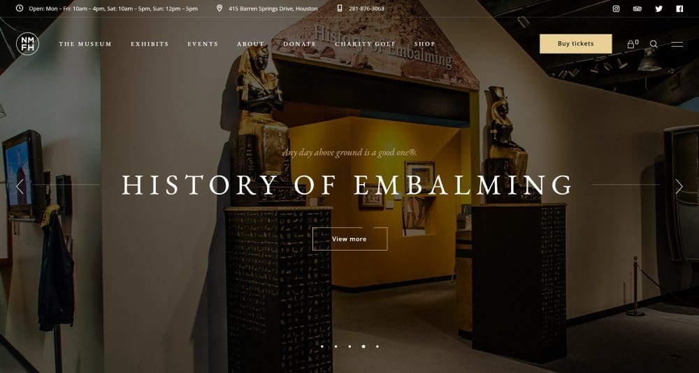
7. The National Museum of Funeral History
One of the more unusual destinations on this list, the 30-year-old National Museum of Funeral History in Houston, TX, features America’s largest collection of authentic historical funeral service items in 15 permanent exhibits. Visitors learn about the evolution of embalming and cremation practices through history, the making of caskets and coffins, and the details of famous funerals for Presidents, Popes and celebrities.
The web design suits the material, though it leans toward the somber and august rather than the morbid and quirky style of the similarly offbeat Mütter Museum. A rotating banner of dark, high-quality photography fills the page from edge to edge when you arrive. The tones are all black, dark gray, and muted gold accents on a white background. Images pan slowly to keep the viewer’s visual interest.
The Best Museum Websites for Art Lovers
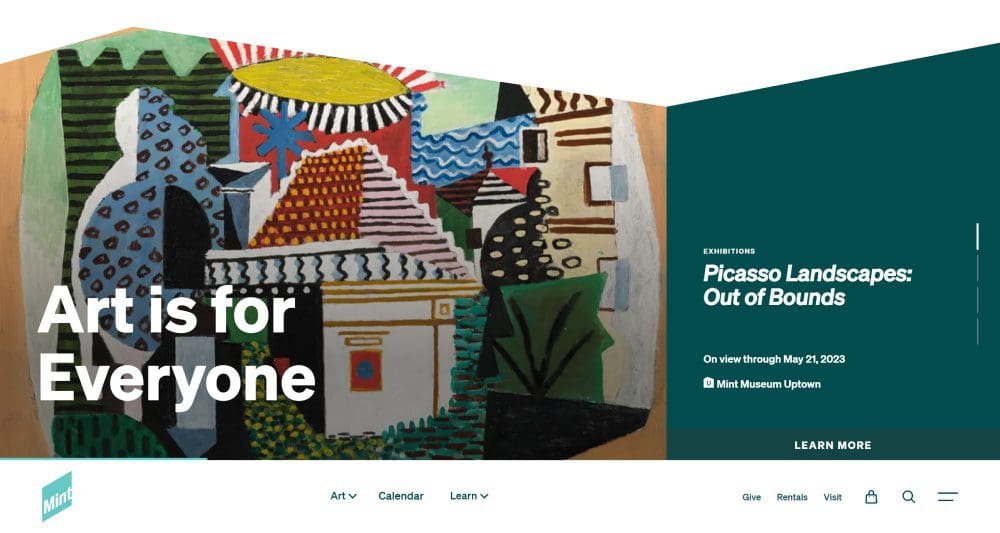
8. The Mint Museum
Founded in 1936, the Mint Museum is a fine art museum with two locations in Charlotte, NC, displaying collections that range from contemporary painting to pre-Columbian pottery. It’s particularly noted for the breadth of its Decorative Arts and Historic Costume and Fashionable Dress collections.
The homepage sports an angular rotating banner that fits the heavily modernist and contemporary style of many of its exhibits. Embedded video and responsive design keep the images dynamic as you scroll down the homepage.
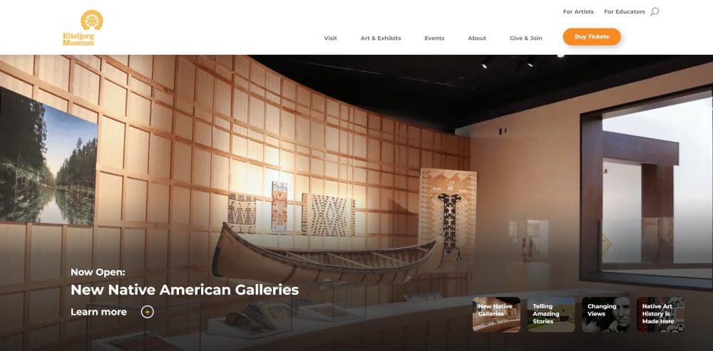
9. The Eiteljorg Museum
Founded in 1989, the Eiteljorg Museum in Indianapolis is one of only two museums east of the Mississippi dedicated to collecting and displaying artistic, cultural, and historical artifacts of the American West and the indigenous peoples of North America. Information on the homepage is clearly laid out and lushly illustrated, with a rotating hero banner linking to featured exhibitions and collections including contemporary Native American art of the Great Lakes region and the photography of Dorothea Lange.
The Best Museum Website for Science Enthusiasts
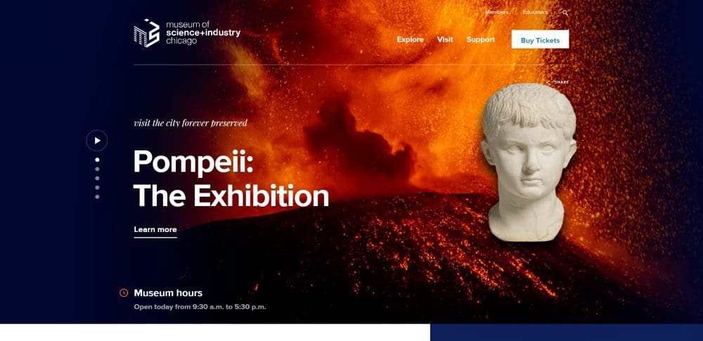
10. The Museum of Science and Industry
At 400,000 square feet, Chicago’s Museum of Science and Industry is one of the largest science museums in the world, but its website is a study in compact and focused presentation of information. Light on words and heavy on illustrations, the front page has a rotating banner with links to exhibits and only three options in its navigation bar: “Explore,” “Visit,” and “Support.” It’s a powerfully simple selection that clearly steers site visitors toward conversion.
The Best Museum Websites for Aquatic Education
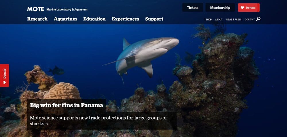
11. Mote Marine Laboratory and Aquarium
With a 10.5-acre aquarium and aquaculture research campus in Sarasota and multiple field stations throughout the Florida Keys, Mote Marine Laboratory and Aquarium is a nonprofit marine education and research institution that studies everything from the population dynamics of coral reefs and aquatic mammals to the effects of human-made toxic substances on the ocean environment.
Big Sea partnered with Mote Marine to overhaul the website’s information architecture in order to foreground the organization’s aquatic research and education programs. Robust SEO-optimized exhibit pages improve the aquarium’s search engine results page (SERP) rankings, and pulsing donate buttons on the side and top menu bar draw the eye and improve rates of community support.
The site also has a playful tone that encourages community engagement and exploration: an embedded video on the home page playfully recounts ever more outlandishly incorrect facts about fish.
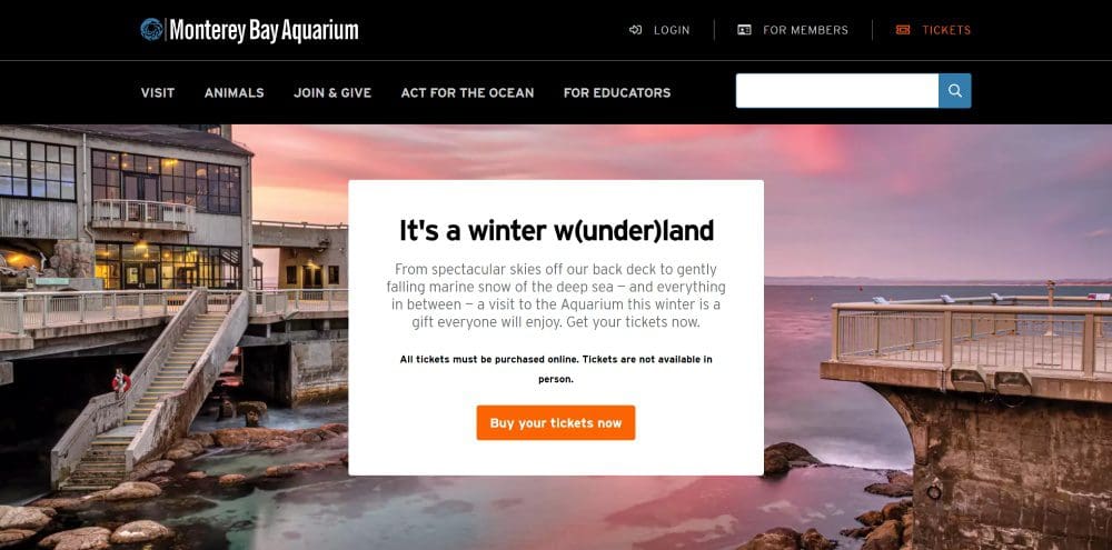
12. Monterey Bay Aquarium
The homepage for the Monterey Bay Aquarium uses parallax scrolling to cycle through different background images as the user explores the page. The images change but the background appears to never move as the text in the foreground scrolls up in neat, attention-grabbing pieces. It keeps the eye focused on the aquarium’s amazing visuals and makes the presentation of information very focused and orderly. (Plus there’s a live otter cam, and that’s hard to beat!)

The Best Museum Websites for Cultural Experiences
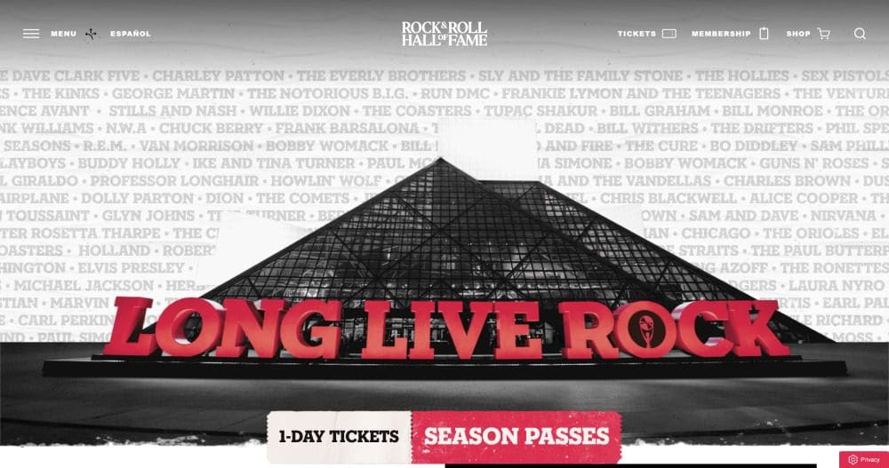
13. The Rock and Roll Hall of Fame
The website for Cleveland’s Rock and Roll Hall of Fame represents a particularly sleek marriage of form and content. Except for the photos, the fonts and the backgrounds are all in a sepia-toned black, white, and red suggestive of old concert posters from the 60s and 70s. There are clever design and copy choices, such as a ticket stub icon for the visitor pass page and a “Start your trip” call to action. They make attending the museum feel like the time you saw Zeppelin at the Coliseum in ‘73 — a tactic particularly well suited to the Hall of Fame’s baby boomer target audience.
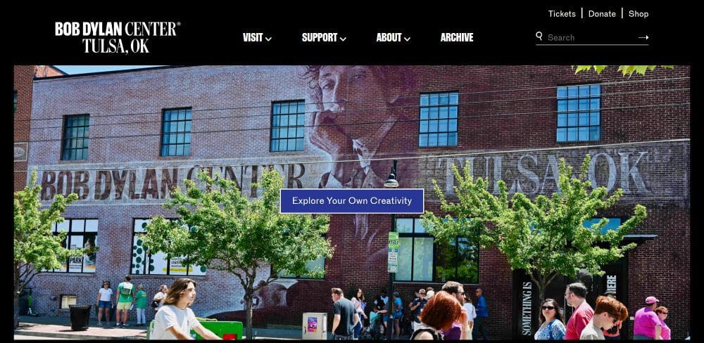
14. The Bob Dylan Center
If the Rock and Roll Hall of Fame covers too much ground for your taste, check out the website for The Bob Dylan Center in Tulsa, Oklahoma. Almost like a presidential library for the iconic singer-songwriter, the collection hosts over 100,000 items donated by Dylan, including original manuscripts of famous songs, rarely-seen photos, original correspondence, and unreleased film and audio recordings.
Like the museum itself, the homepage’s video banner emphasizes visitor engagement — people nod along to recordings and take in the exhibits while the top-of-the-page CTA (“Explore Your Own Creativity”) drives home the connection between visiting the museum and self-cultivation. A recreated 1960s recording studio and a 55-seat screening room guarantee that visitors will get the chance to put themselves in.
The Best Museum Website for Interactive Experiences
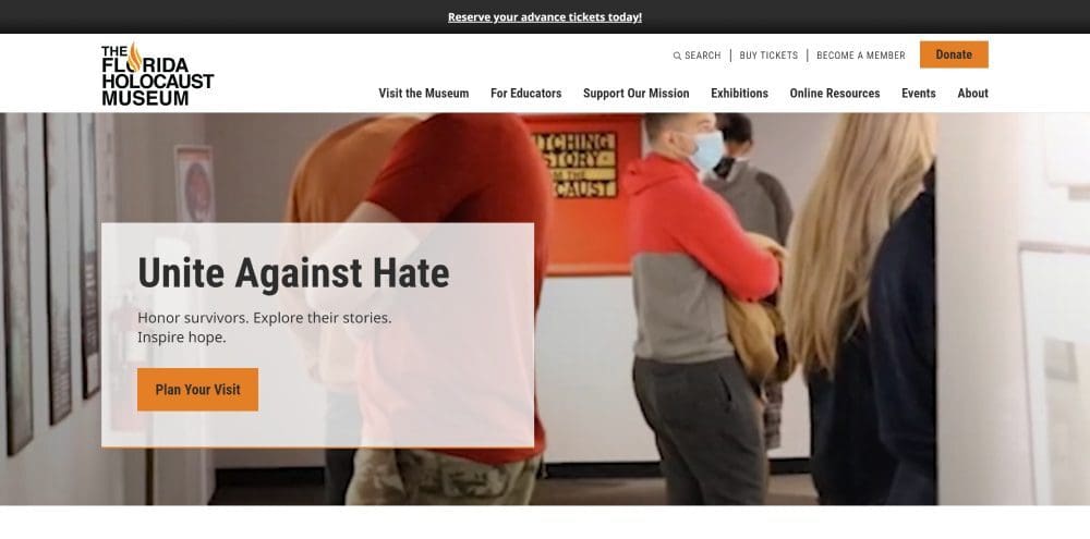
15. The Florida Holocaust Museum
One of the largest museums of its kind in the U.S, The Florida Holocaust Museum was founded in 1992 and played a pivotal role in shaping a state mandate in 1994 that Holocaust education be included in K-12 school curricula.
The homepage has a video banner that shows people engaged with the museum’s exhibitions, including the interactive Dimensions in Testimony℠ exhibit, which uses natural language technology and ultra-HD filming to allow museum-goers to interact with the recordings of Holocaust survivors. Information about how to get involved — through visiting, volunteering, or donating — is laid out clearly and succinctly on the page and the banner headline, “Unite Against Hate,” connects visitors’ engagement with the museum’s broader mission to stop antisemitism.
The Best Museum Website for Virtual Tours
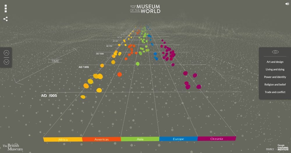
16. The Museum of the World
A partnership between Google and The British Museum, The Museum of the World really is a standout in dynamic, interactive web design. Objects from the British Museum’s collection are color-coded by their region of the globe and laid out like constellations on a three-dimensional timeline users can navigate by scrolling up and down. Visitors begin at the present day and can scroll all the way back to 2,000,000 BC. It’s an exciting experiment in visualizing history — one that lets you see the way the museum’s objects cluster around particular times and places — and the site produces a wind-chime sound effect each time the mouse moves over an object. You should definitely check it out!
What Should a Good Museum Website Have?
A great museum website should clearly show new users how to plan a visit or otherwise get involved through donating or volunteering. It needs to have online exhibits that attract potential visitors and offer them a taste of what’s to come when they visit in person. The best museum websites connect up with social media through creative user-generated content that shows visitors engaged with your exhibits and excited to learn more.
Lastly, a great museum website should grow with your institution. It should be responsive to the needs of your organization so that it’s constantly up to date with the latest happenings.
Ready to Elevate Your Museum’s Website Design?
It’s no surprise that world-famous museums have spectacular websites. But you don’t have to have deep pockets and the support of a hundred-year-old foundation to put together a website that will make you stand out and draw new visitors.
At Big Sea, our marketing experts work with museums, attractions, and educational institutions to produce dynamic web design and creative content marketing that convert strangers into fans and fans into supporters. We work across a variety of platforms, including WordPress and HubSpot, and we would be happy to advise you on the right foundation for your site. Reach out to us today!