10 Essential Tips for Nonprofit Branding in 2024
- What is nonprofit branding?
- 10 Tips for Nonprofit Branding
- 1. Dedicate time to your name
- 2. Define your story
- 3. Get to know your target audience
- 4. Solidify your positioning
- 5. Use a variety of tactics to convey your brand's message
- 6. Establish your personality and voice
- 7. Create a logo with longevity
- 8. Understand the meanings behind colors, typography, and imagery
- 9. Keep your branding strategy consistent across all channels
- 10. Hire a nonprofit branding and marketing agency
- 3 Nonprofit Branding Examples We Love
- Get expert help with your nonprofit branding strategy
If you’ve worked with a nonprofit before, you know the struggle: you have to stand out amongst the millions upon millions of other organizations out there.
Not to mention, you have to consistently attract donors to stay afloat, especially in today’s finicky financial climate. So how does nonprofit branding strategy help you stand out in that dreaded sea of sameness – whose monetary waters continue to recede?
At Big Sea, we work with a number of organizations, like these, to help build, develop, and pivot with the times. Whether you’re just starting out or you’re looking for a boost in growth, we’ve got some must-know strategies. Let’s dive in.

What is nonprofit branding?
Nonprofit branding is the creation of a distinct, memorable identity and personality for your organization. But there’s more: that identity keeps your target audience (in this case: stakeholders, donors, volunteers, etc.) in mind.
Put most simply, nonprofit branding is how you develop your organization’s logo, visual identity, mission, voice, and positioning to set yourself apart from all those other nonprofits in the world.
Why is branding important for a nonprofit?
Branding means recognition, no matter what industry you’re in. Picture the Apple brand, for example. Apple’s logo (and Apple itself, at this point) is so iconic, in fact, that you don’t even need any text to recognize the brand. Big-name nonprofits can achieve the same level of clout. Look at the YMCA (the Y) and St. Jude logos.
Reaching this level of recognition can be even more crucial for a nonprofit because beyond expanding your community, most nonprofits have the goal of spreading an important mission locally or even across the globe. Your brand conveys a set of values that you want to share with the world, whether or not they choose to give time or money to your organization.
10 Tips for Nonprofit Branding
There are a few key concepts that help inform any successful nonprofit branding strategy. These include diversity, storytelling, audience personas, and consistency. Let’s explore how each of these plays a role in the essential elements of a great strategy:
1. Dedicate time to your name
What’s in a name? For a nonprofit, everything. Your nonprofit brand’s name is pivotal to its messaging points, personality, voice, design elements and, in turn, your brand’s memorability.
Words mean things – lots of things – and it’s important that your name is specific, unique, and strongly connected to your mission. Consider, for example, the World Health Organization. Not only do these three words instantly preview the organization’s mission, but the acronym itself (WHO) does as well, because it’s really the health care providers (the organizations “who”) that form the backbone of the organization.
2. Define your story
Defining your story not only allows you to understand your brand more deeply, but it also helps your audience connect with your organization in a more human way. While you can have abstract ideas of what you want your nonprofit brand to be, it’s best to use descriptive and factual language in your story.
To get started, consider these questions: “What exactly is your brand?” and “What do you want to be known for?” Jot down your answers, and work with other members of your organization to start to flesh out your narrative.
Let’s say you’re a progressive, inclusive nonprofit determined to fight for the rights of LGBTQIA+ individuals. Maybe you’re an inviting, warmhearted nonprofit dedicated to providing local families with the resources they need to survive and thrive.
While these are representative of totally different causes and might not match your own mission, you can see how each description can be differentiated – or tailored to fit your organization.
3. Get to know your target audience
Who’s going to engage with your brand? Whether it’s the recipient of services, important stakeholders, donors, or prospective volunteers – you have to know them. What media are they consuming? How are they searching for resources?
According to Marketing Evolution, over $37 billion is wasted each year in ad spending because marketers fail to engage with their target audience. A few things you can do to make sure you’re on the right track are:
- Do that market research. Explore current trends and really work to understand how you can fill in the missing pieces in your industry and provide value for your target audience.
- Conduct a competitive analysis. In the nonprofit sector, you can get ideas on what – and what not – to do to sell your brand to your audience.
- Build out user personas. One-size-fits-all rarely fits anybody. When you create user personas, you’re able to carve out a specific space in your industry and really get to know – and connect with – those niche demographics.
- Use your tools. Google analytics, Trends, Answer the Public, Nielsen Ratings, Marketing Evolution and social media analytics are starting points to discovering what your target audience is researching, consuming, and interacting with.
4. Solidify your positioning
In all brand marketing, positioning is how you describe what sets you apart from the others. It drives home to your audience that you’re the best in the game. It should be a top priority for your organization – it’s both your cornerstone and your driving force.
For nonprofits, though, positioning is a bit different. Here, it’s about collaboration, not competition. If your nonprofit provides trans people with gender-affirming medical care, or supports children in at-risk homes , you aren’t competing with a business. You’re collaborating with the community in ways that make you special: nobody does what you do in the way that you do it. “Come on this journey with us” is a message that’s unique to nonprofit marketing.
Answer the question: “Why we do exist when the organization down the road does the same thing?” and things will really start to fall into place. Supporting your organization should be the best possible option for your audience, whether that’s stakeholders, donors, recipients or someone else.
5. Use a variety of tactics to convey your brand’s message
Once you’ve nailed down your positioning, showcasing that to your audience needs to be done clearly and concisely. Brand messaging encompasses your nonprofit’s mission, who that mission impacts, and the values you bring to the table. Messaging comes in many forms, some of which include:
- Taglines
- Use cases
- Testimonials
- Videos
- Blogs
Brand messaging can be a tricky, tricky beast. We recommend drafting an elevator pitch that whittles down everything your nonprofit can help your audience accomplish.
6. Establish your personality and voice
How do you speak to your audience? What do you want to be known as? You might think personality and voice are interchangeable, but they actually depend on each other.
Personality is the emotion and tone you convey to your audience. Are you an approachable and warm nonprofit, a nonprofit with a bit of flavor, sass and class, or are you a more buttoned up, serious nonprofit?
Voice is how you express your personality. This emerges from the words you use. Depending on your industry, your personality and voice might change over time – and it might vary slightly if you’re communicating via different channels like social, email, programmatic display, paid search, video, or audio. This can even evolve with your brand. But your brand should always sound and feel like your brand, not a robot.
7. Create a logo with longevity
We put logos toward the end of the list, and there’s a reason for that. We suggest you build your brand with strong conceptual roots first. That means nailing down your story, messaging, and audience personas right out of the gate.
When the right words make up the foundation of a great emotional connection, fantastic visuals drive that message home, give it the right emotional pitch, and make it memorable. Your nonprofit’s logo is the key to instilling a lasting impression that ensures immediate brand recognition.
Designing for nonprofits means designing for connection. Positivity, hope, and strength are key elements in creating a nonprofit logo that stands the test of time – and stands out.
Look at the World Wildlife Fund’s logo, for example: a simple panda with the “WWF” abbreviation. WWF focuses on wildlife preservation, namely endangered species, and a panda is just that. It’s an easily recognizable logo, and uses simple black and white space to avoid overwhelming the viewer’s eye. It tells a clear story, and it’s easily adaptable to various media.
Most logos consist of some primary elements, all of which require important strategizing:
- Brand colors
- Your brand name
- A tagline
8. Understand the meanings behind colors, typography, and imagery
Color, typography, and imagery are all a crucial part of the meaning behind your logos. They are not merely pretty elements, but they convey ideas to the viewer as well. Let’s briefly consider how each of these elements works to share information with your audience.
Branding Colors
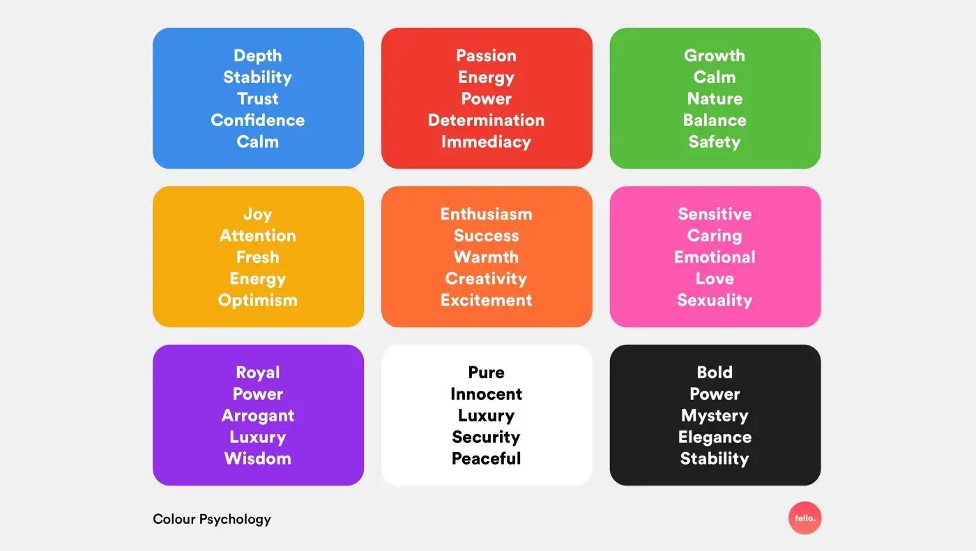
In literature and in life, colors represent more than just beauty; they each have characteristics, elicit emotions, tell a story, and make a statement.
For that reason, choosing colors for your brand means going outside of your comfort zone. Colors that look pretty together don’t always best represent your brand.
For example, red is an extremely bold color. It represents larger-than-life, passion-filled emotions. Blue is a more tranquil, trust-inducing color. However, these also represent the colors of political parties your organization may not want to be associated with.

Source: UX Planet
Typography for Branding
Typography is how your brand visualizes its voice and personality. Think of it as an accent that your brand uses when it speaks. Much like colors, there is also a psychological dimension to font as well. Understanding the different font classes and the emotions that they convey will go a long way toward helping you choose the right look for your brand.
Typographic considerations comprise all the choices related to font, including the stylization and arrangement of typefaces, or the chosen look and feel of letters, words and numeric characters (think Times New Roman, Arial, and Helvetica), and the way they’re styled (think capitalization, changes in font, size, and weight).
As you make selections based on the ideas and emotions you want to convey, keep in mind that your typeface needs to meet practical demands as well: It has to stand out, be skimmable and, most importantly, be accessible. You want your messaging points to be clear and visible to everyone. These decisions have a significant impact on your brand perception.
Selecting the Right Imagery
For us, the most important consideration when it comes to imagery is originality. When sourcing imagery for your nonprofit, we always recommend avoiding stock images, and opting for organic imagery, when possible.
In our professional experience, people respond best to real-life humanity: actual photos of your organization in the trenches, really doing that work, making a difference and working for that impact, whether that’s seen through photography, illustration, or data visualization.
9. Keep your branding strategy consistent across all channels
Remember: branding is about recognition. To stay recognizable, it’s important to maintain consistent branding across every medium you use, whether it’s your website, social media accounts, blog posts, or advertising campaigns. Use a design tool like Figma or Canva to create a suite of assets that you can use across various channels to ensure that there is clear cohesion between the different elements.
Your nonprofit’s website is key to consistency. As a home base for your company’s image, it should establish your brand – visually and tonally – and stay consistent with what you’re pushing on social, in programmatic, blogs, and other forms of outreach.
10. Hire a nonprofit branding and marketing agency
Nonprofit branding is no easy feat, especially when doing it on your own. When you work with a nonprofit-specific marketing agency, you’re hiring the experts: experienced and well-seasoned vets of nonprofit branding and marketing.
A nonprofit branding agency can help you:
- Understand your industry
- Get in touch with your audience(s)
- Develop or update branding guidelines
- Collect data about your donors, volunteers, web visitors, and more
- Experiment with personality, voice, and design
- Pivot based on financial and economic shifts
- Secure long-term success with stakeholders
3 Nonprofit Branding Examples We Love
It’s not the size of a nonprofit that grabs an audience. It’s the marketing. Here are some of the nonprofit brands that are really grabbing our attention:
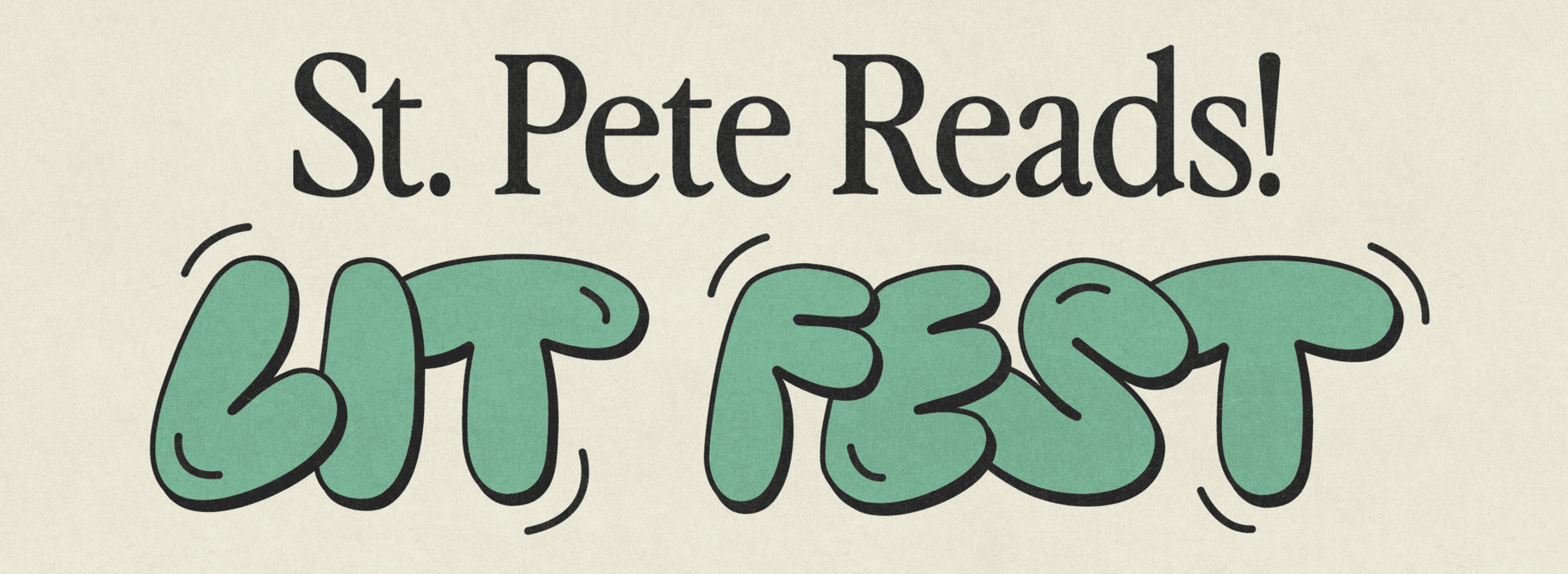
1. St. Pete Reads! Literacy Festival

Source: culturedbooks.org
Branding as a smaller, local nonprofit is tricky work, and we’re loving what St. Pete Reads is doing. Hosted at the Dr. Carter G. Woodson African American Museum, St. Pete Reads! Lit Fest is a celebration of all things literacy, especially in relation to Black youth and families.
At the festival, which is held in November, kids can enjoy book signings, interactive storytime, youth poetry workshops, education panels, and opportunities to connect with the broader community.
Their brand logo and deliverables use editorial formatting, a nice vintage font, and image gradient to connect the past with the present, while their active, rounded typeface appeals to kids. This is a nonprofit that looks and feels fun.
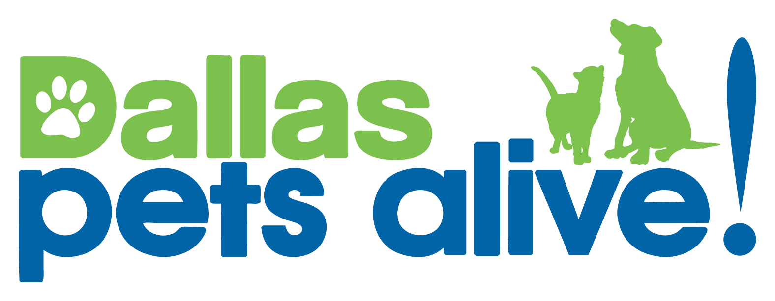
2. Dallas Pets Alive!

Source: Dallas Pets Alive!
At its core, Dallas Pets Alive! is a no-kill shelter that also promotes and provides educational resources and programs to prevent the surrender and eventual killing of companion animals in North Texas.
While there are other no-kill shelters in the Dallas-Ft. Worth Metroplex like Operation Kindness, DPA provides more specialized, unique resources, like their Positive Alternatives to Shelter Surrender (PASS) program, which offers responsible rehoming, medical, training, temporary housing and other resources to DFW residents in need.
Their logo and branding materials are youthful, cute, with a slightly misshapen typeface. They’ve got an animal-driven connection with paw prints and silhouettes of family pets.
But DPA is more than its logo. We also love them for their 2014 #AdoptableTrends campaign, which saw them comically rename their dogs as the most commonly searched terms of that year (i.e. “Kim Kardashian’s Butt and “Supreme Leader Kim Jong Un”), to help them prioritize rescuing and fostering dogs.
We are paw-sitively giddy over their nonprofit work and their marketing strategy.
3. For The Gworls

Source: For The Gworls
Brooklyn-based For The Gworls is truly unique: a trans-led collective that helps Black trans people pay for rent, gender-affirming treatment, and travel. Their support goes beyond New York – they’ve helped change lives of trans people around the world.
For some Black LGBTQIA+ folks, “gworls” serves as a term of endearment – especially for trans people. For The Gworls definitely makes a splash with its unique, grassroots-style approach to fundraising, showcasing diverse trans people in its promotional and organic social posts.
Get expert help with your nonprofit branding strategy
At Big Sea, we’ve collaborated with many nonprofits, from grassroots community programs to mutual aid organizations and huge national brands. And we see real results. We’re particularly proud of the work found in these case studies.
Contact us today to learn how we can help you build a meaningful, memorable brand strategy for your nonprofit.


