Donation Forms for Nonprofits: 5 Easy UX Tips
Long gone are the days when fundraising took place exclusively at a bake sale, silent auction, or even a gala. For nonprofit organizations of every size, raising money online has become a necessary — and often pricey — enterprise. If you’re going to spend the time, resources, and expertise to bring in online donations, you need to use a format that’s going to change the curious into contributors.
1. Make it really, really easy
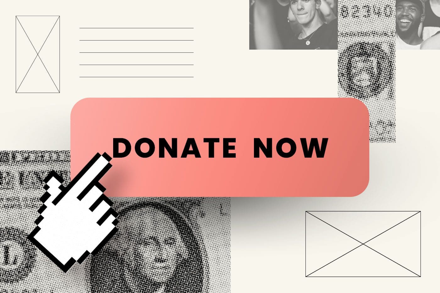
Don’t put bumps in the road — donors will bounce! Keep it simple. Put your logo and nonprofit info at the top, use a very clear and engaging hero image, and keep your copy in the “need to know” realm. We recommend using 5 or fewer gifting options, and always add a box for other donation amounts. You may end up with higher donation values that way. Use as few fields as possible. Think about how short and sweet your lead generation form is. Go that way.
Point out required fields very clearly. Donors don’t like getting to the bottom of the page and realizing they’ve missed something. Keep your “submit” or “donate” button large and clear and always, always collect email addresses.
Tip: your donation form also serves as a lead gen opportunity, so don’t let all this great donor information go to waste.
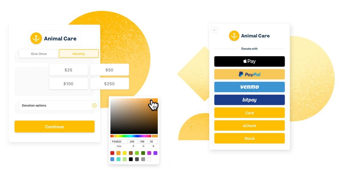
It’s important to make things as simple as possible. The fewer clicks and hoops to jump though the more likely someone will be to give. Leverage one-click donor opportunities similar to Amazon’s one-click buying and be sure to accept donations in a multitude of ways such as PayPal, Apple Pay, Venmo, or even Cryptocurrency.-Jen LaRue, Big Sea, Associate Vice President, Marketing
2. Make it mobile-friendly
Desktop sites and mobile sites are different and so is their UX. This isn’t anything you don’t already know. Think about mobile and desktop users when designing your forms and the pages they live on. You might even vary your mobile CTA to drive traffic to your Facebook page.
On mobile, less is more, and that goes double for donation forms. Donors don’t need the clutter — they’re here to make a trade. You tell them an incredible story about your organization and what it does — and they’ll give you information, and hopefully donations, through this form. So keep distractions and animations to a minimum.
And it’s not just about being pretty and user-friendly. Ever since Google moved to mobile-first indexing, mobile optimization has become a key ingredient in any web development or design recipe. Bad optimization can kill your rankings, which brings conversions down.
3. Make it fast
This applies to mobile forms in particular. When it comes to mobile conversion, we often see potential donors bounce from forms because they load too slowly. On mobile sites, a one-second loading delay can decrease your overall conversions by up to 7%. If you aren’t getting the mobile conversions you were hoping for, analyze your page speed using Google’s Lighthouse tool. Adjust your code and content accordingly — especially when it comes to images.
4. Make yourself available
Use a live chat feature as part of your UX strategy to answer any donor questions. In some cases, donors might leave your site because they simply aren’t sure about what the organization does, where the money might go, etc. A live chat (and a very, very responsive one) can help increase conversions by guiding donors over the bridge.
Tip: be prepared to work some additional features of your organization in your chat response. It may sound sales-y, but this can be a critical close-the-deal kind of moment.
5. Make it yours
Your donation form, no matter where it’s located, needs to integrate seamlessly with the rest of your branding. This is supremely important when your donation form is on a landing page or pop-up — which users can often mistake for ads and spam. If your form UX looks and sounds like you, donors will know they’re in the right place.
We recommend using a program like Funraise, which lets you customize your forms’ content, layout, and design — then embed it into your website easily.
You can set custom questions, recurring frequencies, provide an impressive list of payment methods, allow donors to attach dedications to their gifts, incorporate company matching automation, add on an abandoned cart popup, and even track donation habits like time of day and location.
5 example donation forms for nonprofits that we love
These forms have all the UX goodies. First of all, each one is accessible, credible, desirable, findable, usable, useful, and valuable. Plus they’re easy to use, mobile-friendly, fast, and branded.
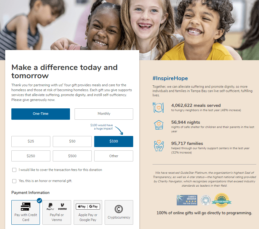
Metropolitan Ministries
Metropolitan Ministries’ desktop version (shown here) comes with lots of additional information about what the organization does — and who donors will be serving. They highlight their most-targeted dollar amount, offer a memorial gift option, and even let donors cover the cost of transaction fees.
UNICEF
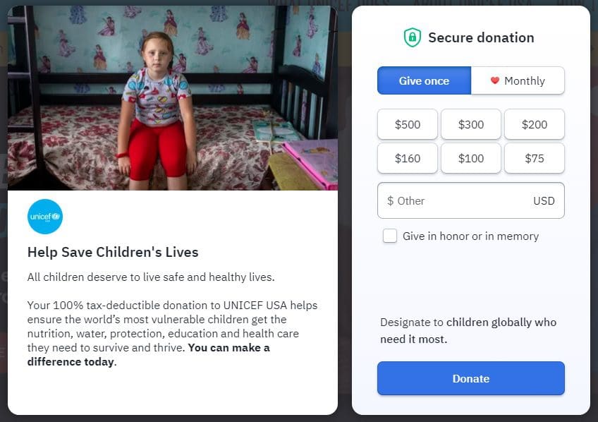
Several major nonprofits, like the American Heart Association, use this same popup template, which welcomes you when you arrive at the UNICEF USA homepage (notice the two “Donate” CTAs also on their homepage). UNICEF provides some data beside their form — helping to convert any uncertain donors. Major bonus points for the three FAQ buttons under the form itself, which can answer some of those burning questions (remember: make yourself available).
Black Girls Who Code
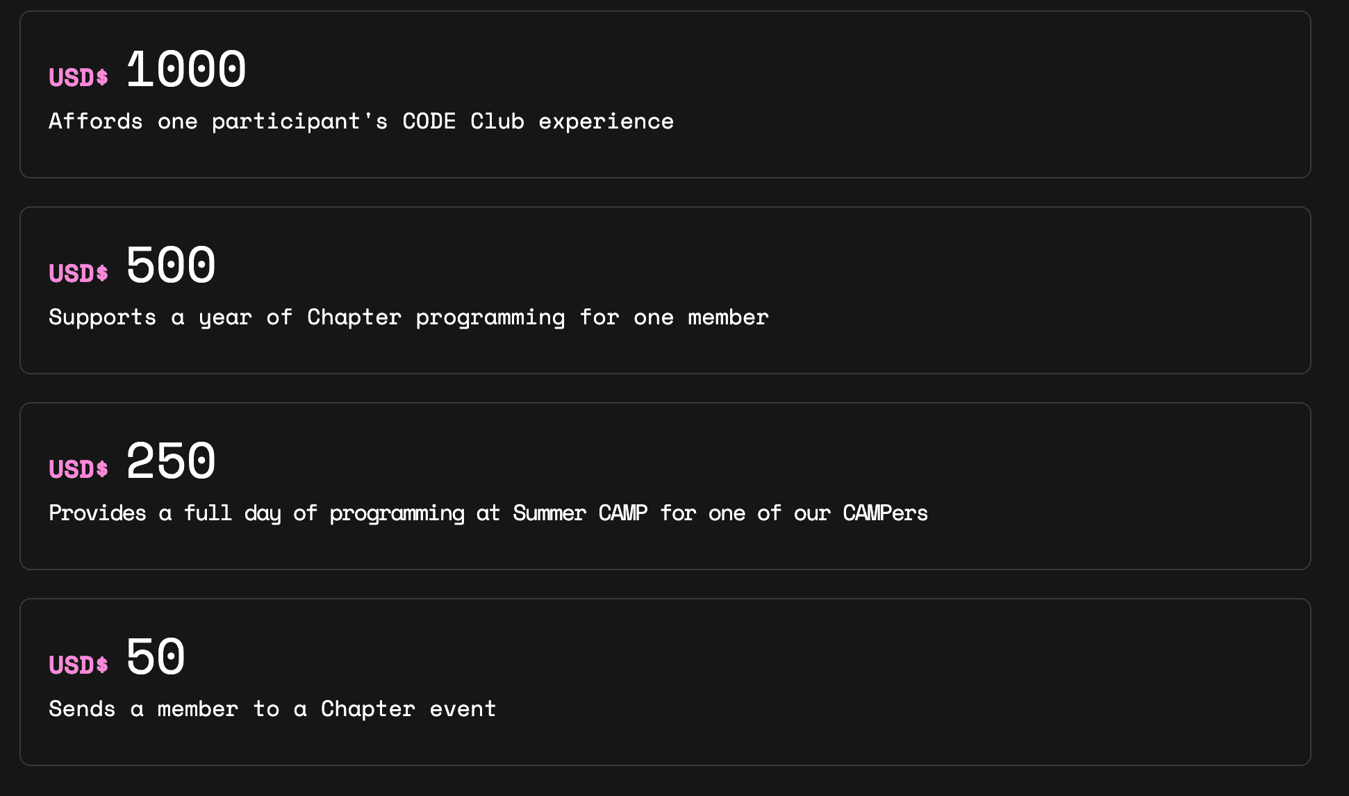
This techy nonprofit uses a default form embedded in their site, but uses their own page’s content to highlight the value of key donation amounts on their organization. What does each level “buy” for a donor? Make your visitors care by making it personal, and they’ll be convinced to spend just a little more than they may have otherwise.
World Wildlife Fund
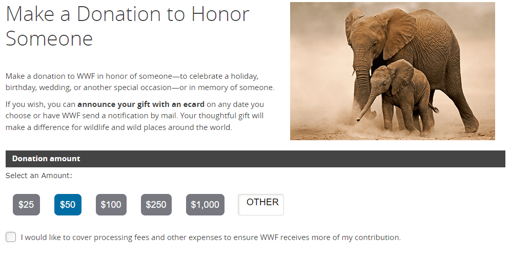
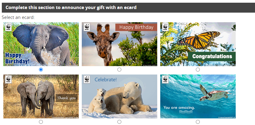
The World Wildlife Fund (WWF) wants donors to connect with the world around them — whether we’re on four legs or two. They’ve got a special form dedicated to honoring or memorializing a loved one through a donation. While they aren’t the only nonprofit that goes this direction, they’re the only one we can find that sends the honoree a special announcement — via postal mail or e-card. That’s an added value that is almost certainly driving conversions.
National Museum of African American History & Culture
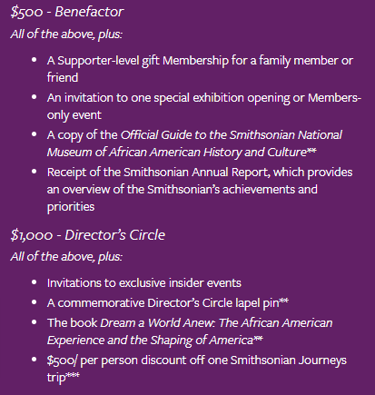
While the museum welcomes and encourages donations of any amount, their sponsorship tier-based system presents added value for donors in the form of invitations to special events, commemorative memorabilia, books, discounts, and more. Naming the tiers ensures that donors feel proud of their contribution — which can go just as far as tangible rewards.
Nonprofit donation form FAQs
How does nonprofit donation form design help increase revenue?
If the form is attractive, engaging, and easy to use, people will use it to donate money to your nonprofit. A little creativity on the development side will also increase the form’s impact. Adding clickable donation values and providing options for recurring gifts are just a couple of ways that you can boost revenue with your form.
And that’s all easy to say — but what does it actually look like?
What should be included in a nonprofit donation form?
There are a handful of items that simply must be in your donation form. Any online template you use is going to have these items available – if not required.
- Details about your nonprofit and its mission
- Information fields (the really important stuff)
- Donation tiers, including name-your-own
- Option for recurring donations
- Payment processor
There are some back-end processes you’ll want to integrate as well. Your form should automatically generate donation receipts, provide a redirect URL to keep users engaged with your story, and present a thank-you message (with a call to action to share, forward, or take a next step). Plus: don’t forget about your abandoned cart email campaign, to re-engage those on-the-fence donors.
What are best practices for nonprofit donation forms?
Design is fun. It’s where we get to express our creativity and tell our nonprofit’s story in engaging and exciting ways.
But it also has to work. When it comes to UX, there are seven things every page needs. It should be:
[row]
[column class=”col-12 col-bsd-12 col-md-12 col-lg-6 col-xl-6″]
- Accessible
- Credible
- Desirable
- Findable
[/column]
[column class=”col-12 col-bsd-12 col-md-12 col-lg-6 col-xl-6″]
- Usable
- Useful
- Valuable[/column]
[/row]
Wherever your donation form lives — give that page (or landing page or pop-out) the same UX love you’d give the rest of your site.
Let’s craft a donation strategy to power your mission!
The team at Big Sea is full of nonprofit marketing experts. We’ll work with you to create easy-to-implement, actionable strategies that take your donation numbers to the next level. Ready to dig in?
