Museum Websites Are Competing with The Couch, Not Other Museums
Here’s a sobering (but fascinating) fact for anyone in the business of getting warm bodies through the door at a cultural institution:
Only about 9% of people feel motivated to visit a museum in their free time.
Compare that with the 70% who are motivated to visit friends and family, or the 66% who are motivated to visit major metro areas.
There’s a lesson here that museum marketers understand at a broader promotional level, but less so when it comes to web design. Most museum websites are designed to answer logistical questions for people who’ve already decided to visit. They confirm hours, post ticket prices, and tell you where to park. They do all this efficiently, even beautifully!
But the people you’re losing never get that far. They’re sitting on their couch on a Saturday morning, scrolling their phone, half-thinking about what to do today. As Sree Sreenivasan, the former chief digital officer at the Metropolitan Museum of Art, put it, “People ask me: What is your biggest competition? Is it MoMA? Guggenheim? Our competition is Netflix. Candy Crush.”
Your website has a tight window to make your case before people pick the path of least resistance. If your page shows them that your museum is an enriching way to spend time with family or an essential stop on their day out downtown… well, that’s a big step in the right direction.
This blog post will help you rethink what your museum website needs to accomplish. We’ll walk through what your homepage should be doing differently and show you how to reframe your “Plan Your Visit” page as what it actually is: a sales page.

Most Homepages Don’t Make a Case, They Make Announcements
If your website’s job is to persuade someone that visiting is worth their Saturday, the homepage is where that argument starts. And right now, most museum homepages aren’t making an argument at all.
Pull up a typical museum homepage, and you’ll see a hero image of the building or a current exhibition. There’s a navigation bar, a grid of upcoming events, maybe a membership callout, and a footer full of logistics. It’s a directory. It tells you what’s happening, but it doesn’t tell you why you should care, why today is the day to go, or what it’ll feel like when you’re there.
The missed opportunity here is enormous. More people are looking at museum websites than ever before. The traffic is there. The question is: What happens when they arrive?
The moment they arrive on your website, that person scrolling on the couch needs to feel something. They need to picture themselves there. They need to believe the experience is worth the effort of getting ready, getting in the car, finding parking, and spending money. Your homepage needs to make that case, and it needs to do it fast.

Here’s what that looks like in practice.
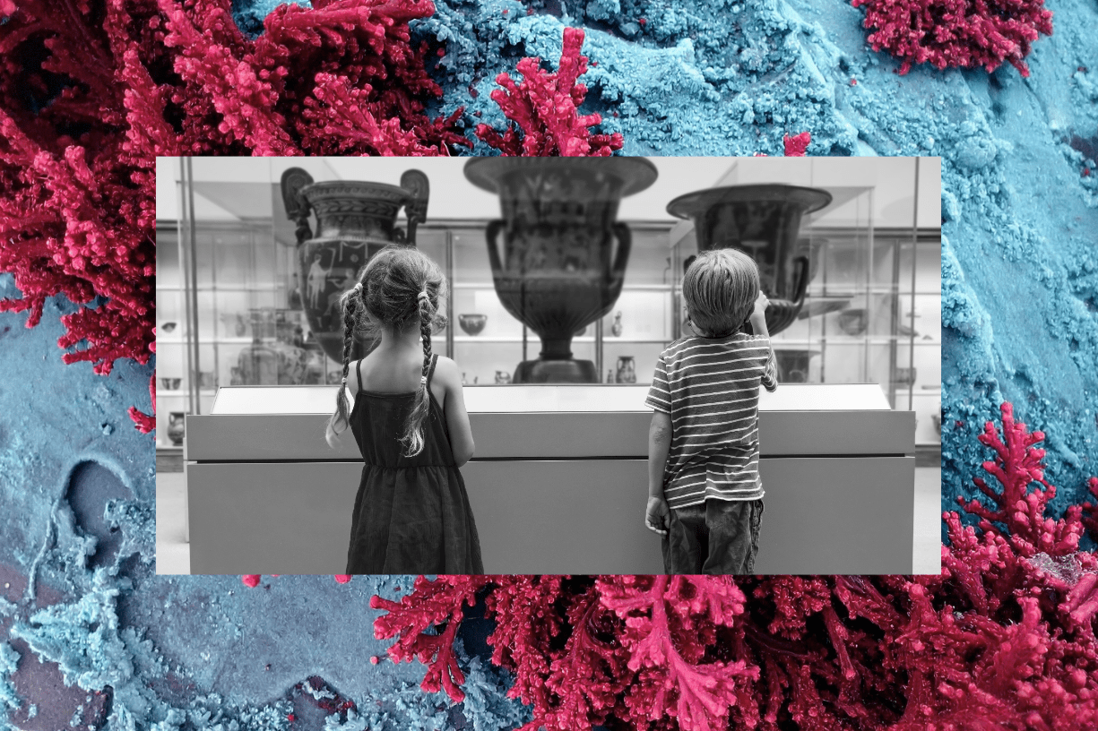
1. Lead with the experience, not the exhibition title.
Your hero section should show people having the experience. There should be laughter, wonder, kids pointing at something, couples leaning in close. Your homepage should show what this will feel like.
2. Use social proof where it actually matters.
Visitor quotes, review snippets, or user-generated content should go near the top of the page. Don’t bury your testimonials in a carousel nobody clicks through. Thirty-seven percent of museum visits come from word-of-mouth and personal recommendations—more than from search, paid media, or social media combined.
At Big Sea, we love a well-turned phrase as much as anyone, but your audience will trust other visitors more than they trust your institutional voice when it comes to making this decision. Give those voices prominent placement, and make it easy for people to share their experience.
3. Lean into the emotion, instead of the transaction.
“Buy Tickets” is a transaction. “Plan Your Saturday” is an invitation. The call-to-action language should evoke the experience the person is actually having, not the action your ticketing system requires them to complete. This is a small change that signals a fundamentally different understanding of what your website is for.
4. Stop leading with institutional identity.
As our CEO Andi Graham puts it: “Nobody is sitting on their couch, looking at your website, and thinking, ‘Wow, this organization provides holistic, community-centered educational programming, I should go.’ They’re thinking, ‘Does this look like it’s worth putting on pants for?’”
Your positioning and mission matter, but they earn their place further down the page, after you’ve earned attention. Your homepage may be your only shot with this audience. Don’t spend it on a mission statement.
The Homepage Test: Pull up your museum’s homepage on your phone. Pretend you’ve never heard of the place. After five seconds (seriously, set a timer), can you answer these three questions:
- Why is this worth a trip?
- What will this feel like?
- What do I do next?
If you’re uncertain how to answer these questions after five seconds, your website has a persuasion problem.
“Plan Your Visit” Is a Sales Page: It’s Time to Treat It Like One
Even if you’ve got a persuasive homepage moving visitors in the right direction, too often the Plan Your Visit page fails to build on that momentum. Every element on this page should move someone closer to visiting; otherwise, friction or simple inertia makes it easier just to stay home.
To keep the page from introducing friction, you’ve got to think like a salesperson. Museums sometimes overlook this basic insight because prioritizing “sales” can feel misaligned with your mission. However, the basic fact is that 76% of museum professionals consider online ticket sales a core revenue channel, yet the pages responsible for driving those sales are built for information delivery, not persuasion. No wonder more than half the people who land on a museum website leave without taking any meaningful action.
Your Plan Your Visit page should be organized around your visitor’s decision process. People who came from the homepage feeling intrigued but not committed still have a mental list of objections, even if they aren’t articulated consciously:
- How long will this take?
- What’s the parking like?
- Will my kids lose interest in 20 minutes?
- Will I feel out of place if I don’t know anything about art?
- Is this going to cost me $80 for a family of four?
Your Plan Your Visit page needs to swiftly answer those questions before they become reasons to close the tab. Here’s how to do it.
1. Lead with a reason to visit today, not just logistics.
The top of the page should reinforce desire. A compelling image, a line about what’s currently on view and why it’s worth seeing now. Then move to the details. Don’t open with a table of hours and prices. Nobody was ever persuaded by a table.
2. Address the real barriers, not just the operational ones.
“Free parking available” is logistics. “Free parking right next to the entrance. No garage, no circling the block” is barrier removal.
“Admission: $15” is logistics. “$15 for an afternoon your kids will actually talk about at dinner” is reframing—same facts, different emotional math.
3. Show the visit as part of a larger, better Saturday.
If there’s a great café inside, mention it. If there are restaurants within walking distance, say so. If the museum is near a park or a waterfront, connect those dots.
Remember, as we said at the start, most potential visitors are motivated by social time with the people they care about, not by the museum itself. Position the visit as part of an appealing outing. You’re not selling a museum trip. You’re selling a great afternoon.
4. Make timing feel easy, not restrictive.
“Open Tuesday through Sunday, 10 a.m. to 5 p.m.” reads like a constraint. “Drop in any day but Monday. Most people spend about 90 minutes, so you’ve got plenty of flexibility,” reads like an invitation.
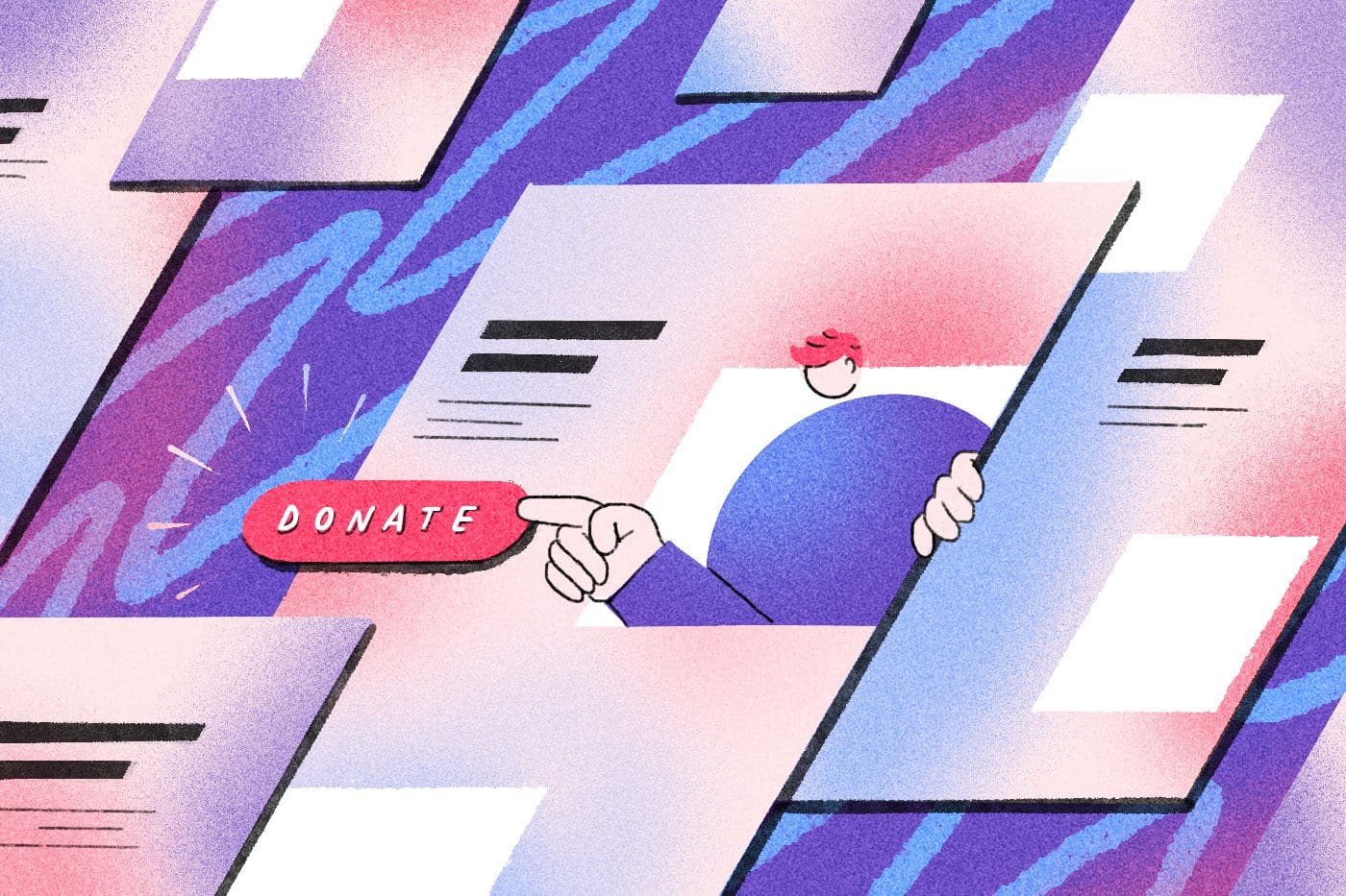
5. Treat the ticket purchase as the smallest possible commitment.
If you offer timed entry, frame it as “pick a window that works for you” rather than a rigid scheduling exercise. If you offer free admission or pay-what-you-wish, lead with that. Every additional click, every additional decision, is a chance for the couch to win. Case studies have documented improvements of 25 to 60% in conversion rates from CTA simplification and mobile optimization alone. Most museum Visit pages leave significant revenue on the table due to unnecessary friction.
A Quick Friction Audit: Walk through your own Plan Your Visit page on a mobile phone as if you’ve never been to your museum. Count the number of taps between landing on the page and completing a ticket purchase. If it’s more than four, you’re losing people. If it takes more than 60 seconds, you’re losing even more. Time it. You might be surprised.
Don’t Let the Couch Win
Sitting on the couch isn’t better than your museum. But it’s certainly easier. You have wonderful things to show people, but first you have to get them in the door.
At Big Sea, we help museums and other cultural institutions make the most of their online outreach. From web design to email marketing, paid advertising, or social media strategy, our team meets your audience where they are with a pitch that gets them out of the house and into what you’re all about.