
15 Flaws in Your Lead Generation Website
The world’s most visible brands understand that their websites are sales reps, marketers, and brand ambassadors. A great lead generation website should be easy to access and intuitive enough for anyone to use. These best sites provide amazing experiences on a consistent basis, and the generate lots of new business for the organizations that have invested in them.
Unfortunately, many businesses fall short when building sites explicitly for lead generation. Whether the site is slow to load, full of broken links, or confusing to navigate, lots of issues can send potential customers to your competition.
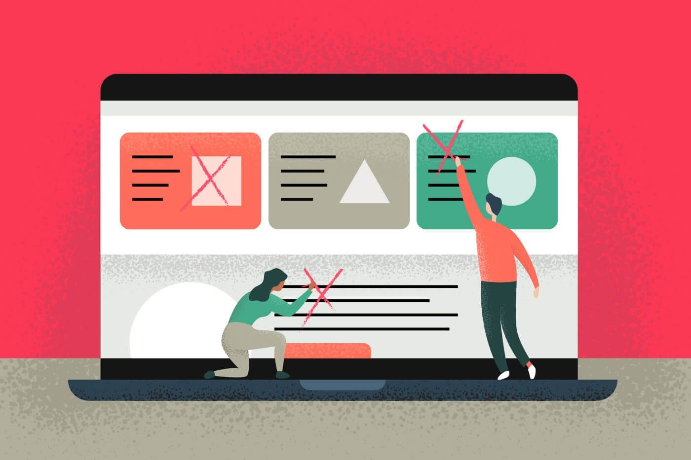
15 Flaws in your lead generation website
With that in mind, we created this list of 15 marketing mistakes that most businesses make on their lead generation websites.
1. Your website loads too slowly
Site speed is a fundamental pillar of good web design and it’s a major factor when people browse the internet. When a site takes too long to load (10 seconds on desktop, 3 seconds on mobile), people tend to hit the back button and move on to the next site.
Visitors expect a quick loading page, so here a few things to consider when improving page speed:
- Reduce your image sizes to below 150Kb to prevent large images from slowing your website to a crawl.
- Reduce the number of scripts and plugins, and look to compress and minify your use of Javascript and CSS, or place them toward the bottom of the page, so the site content can load before any render-blocking scripts.
- Get a website hosting plan that fits your needs, and don’t try to scrimp on costs. Otherwise, you’ll be delivering a subpar experience to your visitors, and it’ll cost you a lot more business in the long run.

2. Too many choices and unclear calls to action
Often times, we assume that if we offer a wide selection, people will be more likely to make a purchase. However, this can backfire for businesses. Too many choices can confuse a visitor, leading to analysis paralysis, where no action is taken.
A great example of this is a Columbia University psychology experiment where participants were asked to make purchases at 2 jelly stores: one with 6 options of jelly, and one with 24 options.
Contrary to common sense, sales were higher at the jelly store with fewer options, and not by a small amount. Experimenters found that the store offering only 6 options generated nearly 10x the sales as the store with 18 more choices. Sometimes, presenting too many options for consumers can be detrimental to the bottom line.
In short, make the next step clear for your visitors to take and remove elements which might distract from the desired goal. Use specific and compelling CTAs that draw your visitors’ attention and spell out what you’re asking them to do.

3. Your website isn’t mobile friendly
Mobile traffic accounts for more than half of all internet traffic nowadays, so having a mobile-friendly page shouldn’t be an afterthought: it’s necessary for business in the 21st century. Make it easy to view your site no matter what device someone is using. Because if they can’t view your site, they’ll visit someone else’s.
Another important point to consider: People convert differently based on the device they’re using. For example, If you have a long form that you want people to fill out, desktop users might have no problem with the request, but many mobile users will immediately bounce from the landing page. To avoid losing these prospects, offer an option to email a link. It’s far easier for a person to give out an email, and follow up later, than it would be to fill out a 10-minute form on a smartphone.

4. Clunky copy and keyword stuffing
Keyword stuffing makes websites look untrustworthy. Whether it’s a title tag that’s stuffed with a target keyword multiple times in an attempt to “rank better” on Google, or your site is full of pages that have the same awkward phrase repeated multiple times, spammy sounding copy makes visitors feel apprehensive and think twice about doing business with you. Great copywriting should be clear and compelling. It should answers users’ questions and present your offers succinctly. (Save the stuffing for Thanksgiving.)
Read more: Using HubSpot to Improve Your Content Marketing>>
5. You’re using generic stock images
When it comes to images on your website, you have 2 legitimate options: Take your own pictures, or pay a photographer. Stock images look cheap and reduce credibility and trust. No one believes that stock images accurately reflect your business, especially when they’ve seen the same images hundreds of times on other websites.
Take photos of your actual office, storefront, and the people who work there. When clients actually visit your business, they’ll have the feeling they’ve been here before, which can help build trust and rapport.

6. You don’t have your local listings set up or they aren’t updated
Are you updating your local listings after you move or change numbers? If not, your old customers and prospects aren’t reaching you. In addition to losing trust in a brand, many people won’t bother to keep looking, and instead reach out to the next business on the search page.
Read more: How to Grow Your Business with Better Local Listings>>
Keeping your NAP info up to date on all the local listing pages so that when it comes time for a prospect to do business, they can reach you the first time, every time.

7. Your site has too many redirects
Excessive redirects make your links seem untrustworthy to visitors, and difficult for search engines to spider and index. After changing or removing a page from your site, update the links across the site in order to reduce redirects to one hop, or just update the link to the newest location. Otherwise, who knows where your prospects will land, and if a search engine will index your pages properly.

8. Your lead generation website is full of interruptions
Despite several marketing “gurus” claiming that escape popovers, pop-ups, and autoplaying videos are a great way to generate leads, these intrusive approaches are annoying to most visitors, and leave a negative impression of your brand. Avoid using disruptive approaches to coerce actions from your visitors and instead, focus on delivering a clear and compelling message, and a memorable experience. One or two well-chosen, clear, minimally invasive pop-ups on a site can help anticipate users’ needs, but a little goes a very long way.

9. Your web design is holding you back
If your site is difficult or confusing to navigate, visitors tend to leave and don’t come back. If all of your valuable pages are hidden behind menus and submenus, most visitors aren’t going to go on a discovery mission to understand your site’s structure just to find what they are looking for. Make it easy for visitors to navigate your site with easy to understand links, a clear navigation structure, sitemap, or other methods to ensure that people can find whatever they’re looking for quickly and easily.
If you feel your site could benefit from a new design facelift, we do that too.

10. It’s unclear how to get in touch with you
If there’s no email for support questions, no phone number for emergencies, and no chat for questions people have while browsing, visitors will go to other sites where someone will help them. Be easy to contact, by making your contact information easily accessible and visible. Just remember: If people can’t reach you, they can’t do business with you.

11. Your forms are too long
Although the sales department might want a dossier on each lead, people are reluctant to fill out long forms full of personal information. Some of the information you could be asking for may be unnecessary, difficult to find, or not even relevant.
Cut your forms down to the bare necessities, collect only the most important info, and ask for more information after you’ve made a connection with an introductory email or phone call. Not only will you generate more leads, you’ll also build trust by creating a personal connection.

12. You’re promoting your website to bad email lists
Rented or purchased lists are completely worthless. None of the people you’ll reach know about you, they haven’t interacted with you, and now their first impression is receiving junk email from you. Consider what you do with unsolicited mail, and imagine 100,000 people doing the exact same thing.
Collect your own lists using innovative approaches, like offering a guide or whitepaper, and only email people who have opted in for communications with your company. Otherwise, the risk of blacklisting, loss of reputation, and flagging as spam may happen.
13. People are landing on your website from poorly targeted ads
Know your target audience. Don’t try to reach large audiences without a large budget. Focus on the best customers and build a specific persona. Narrowcasting is the opposite of broadcasting: the idea of sending your message to a small but very well aligned group. Focus on narrowcasting to your prime potential customers, rather than reaching a large swath of people and hoping that some are interested.
14. Your lead generation website needs A/B testing
Sticking to what you’re comfortable with leads to diminishing returns over time. Try out new promotions, marketing channels, or processes. Test new copy, images, color schemes, CTAs, or landing pages. Run experiments on your ideas in a structured way, so that you can come to accurate conclusions about what works, what doesn’t work, and what could be tested in the future. In short, be curious, and always be learning.

15. There’s no personalization
By using personalization data, you make it easier to forge a connection with potential clients and customers. By adding something as simple as a person’s name to an email subject line, you can improve open rates, engagement rates, and even conversion rates. Use the information your visitors and customers provide (name, location, interests, etc) to create an engaging, unique experience. It sure beats greeting everyone with “Hello website visitor!”

Let us help you optimize lead generation on your website
By taking initiative and focusing on improving the experience your prospects have with your website, you can improve trust, demonstrate value, and ultimately generate more sales and customers.
If you need a partner to help guide you through improving your site and tuning up your marketing machine, we’re always glad to—just send us a message and we’ll chat!
FAQs about lead generation websites
What are the essential elements of a lead generation website?
A good lead generation needs to establish a clear value proposition for the user and provide them with a call-to-action that advances them to the next step in the process (“Download this guide,” “Contact us,” “Watch this free demo,” etc.). The site will also incorporate or lead to a contact form that asks for more than just the user’s email address: this information is essential for segmenting your leads once you’ve got them.
How much does a lead generation website cost?
While it’s easier and less expensive than ever before to create some sort of website for yourself or your organization, generally speaking, websites are expensive. The cost can range significantly from around $500 to $5,000 for a small website depending on what features you need, whether you’re using an online template or hiring a web developer, how complex the site is, and how much work it requires for optimization.
For an expertly optimized, developed, and designed website with pages numbering in the hundreds, expect to pay upwards of $10,000 to $20,000 to redo the homepage, site design, and perform conversion optimizations. While the basics you need to create a site are more accessible than ever, customers’ expectations are also much higher.